Introduction
March 12, 2026
Welcome to the JavaScript Modules documentation!
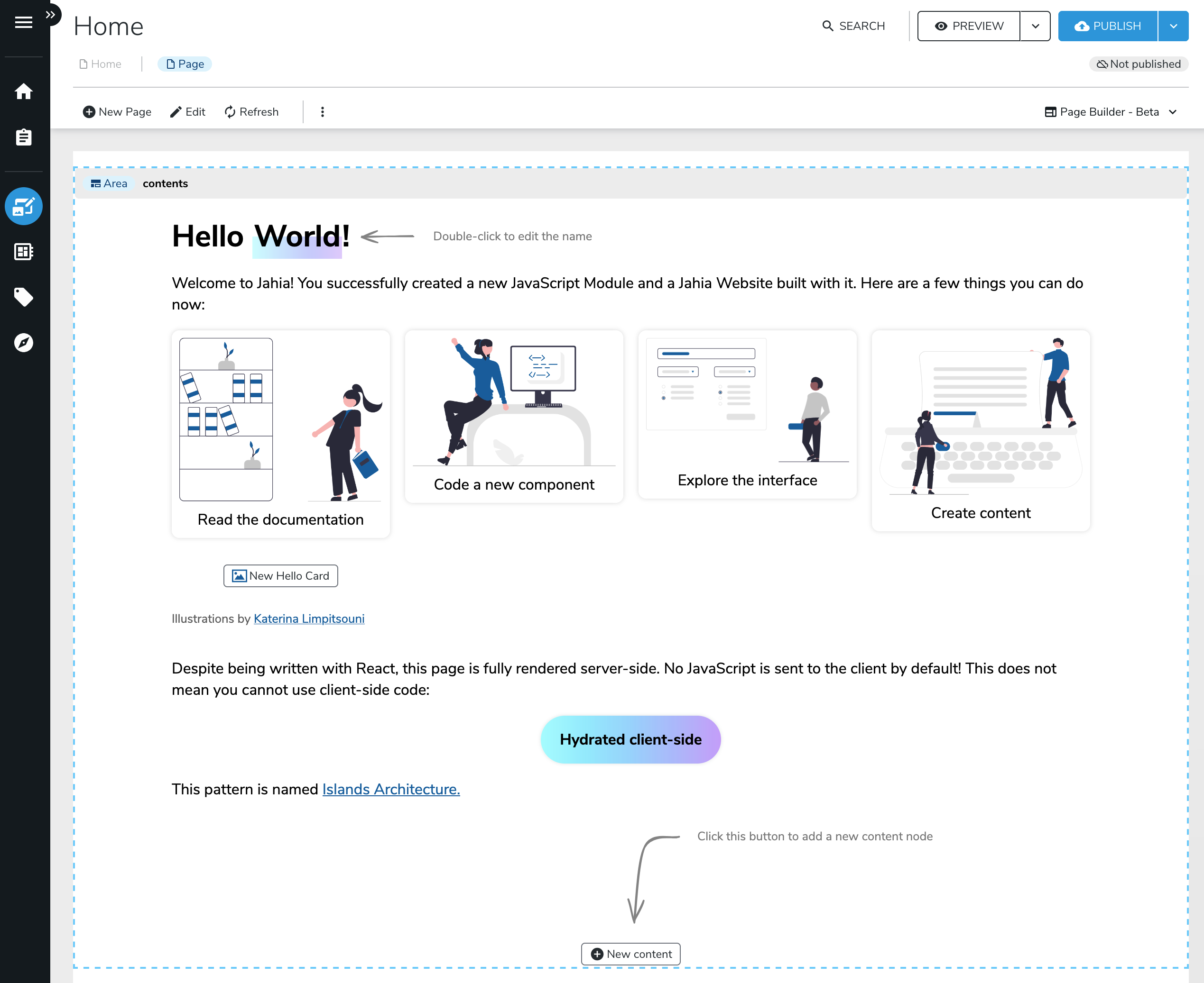
Here is what you would get within minutes. The code is written in React/JSX and made interactive on the client; Jahia is the first Java CMS to support partial hydration/island architecture on the market.
This documentation is meant for self-learning, but we also offer workshops and training sessions with our team. If you are interested in that, please contact us.
If you're still reading this and want to get started—for real—let's dive in!