The "About Us" Page
Our homepage is based on a "basic" layout: take a look at src/templates/Page/basic.server.tsx. It's a single column layout defined by an <Area> without any constraints. If a user wants to place many Hero sections on the page, they can do it. Most websites have a slightly more controlled layout: a navbar, a title, a footer, optional sidebars, etc. In this section, we'll create a page layout that suits a typical "About Us" page.
Page Templates
Pages are content nodes, like the heroSection and heroCallToAction nodes we created previously. Their type is jnt:page, and as for all content, you can tell Jahia how to render them.
We'll create a single-column layout with a hero section on top. Create a file named singleColumn.server.tsx in src/templates/Page:
import { Area, jahiaComponent } from "@jahia/javascript-modules-library";
import { Layout } from "../Layout.jsx";

jahiaComponent(
  {
    componentType: "template",
    nodeType: "jnt:page",
    displayName: "Single column",
    name: "singleColumn",
  },
  ({ "jcr:title": title }) => (
    <Layout title={title}>
      <Area name="header" nodeType="hydrogen:header" />
      <main style={{ maxWidth: "40rem", margin: "0 auto" }}>
        <Area name="main" />
      </main>
    </Layout>
  ),
);
Instead of using jahiaComponent to define a view, we use componentType: "template". A template is like a view but for a full-page resource.
Let's break this code down:
-
The
Layoutcomponent is a simple wrapper that adds<head>and<body>tags to the page. -
We define two
<Area>s:headerandmain. An area is an entry point for editors to add content. By default, an area is of node typejnt:contentList, but since we want to make our header area more specific, we setnodeType="hydrogen:header".
We need to define this new header node. We will make it simple to start with, our header will only contain a hero section.
src/components/Header/definition.cnd
[hydrogen:header] > jnt:content
 + hero (hydrogen:heroSection)
We don't extend hydrogenmix:component because we don't want to make this component available to users. It's a technical node that will contain a single heroSection.
src/components/Header/default.server.tsx
import { jahiaComponent, RenderChild } from "@jahia/javascript-modules-library";
jahiaComponent(
{
componentType: "view",
nodeType: "hydrogen:header",
},
() => <RenderChild name="hero" />,
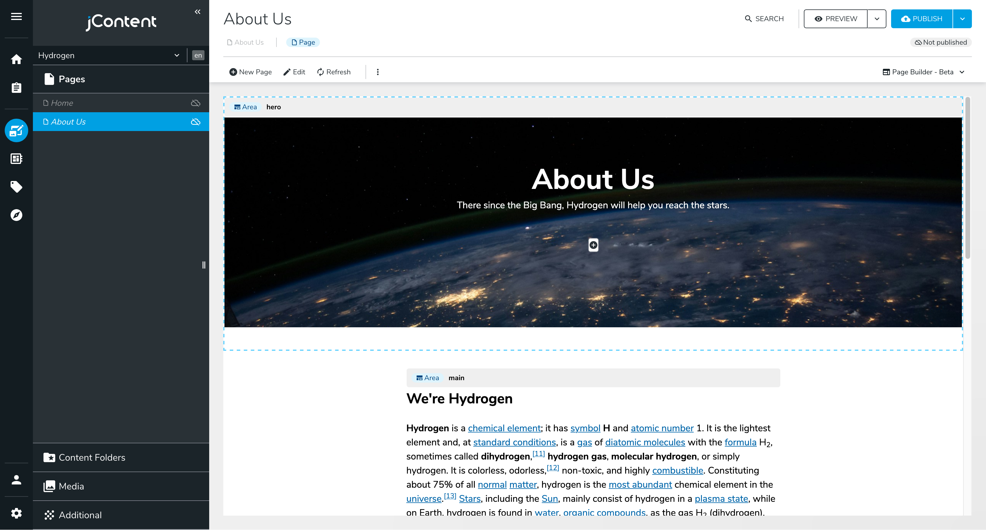
);Go ahead and create a new page on your site. Right click the left panel, under Home, select + New Page and chose the Single column template. Give your page a title and save it. If you don't see the Single column template, you may need to restart yarn dev for the new template to be picked up.
You should now see an empty page with two insertion points: one named hero and the other named main.
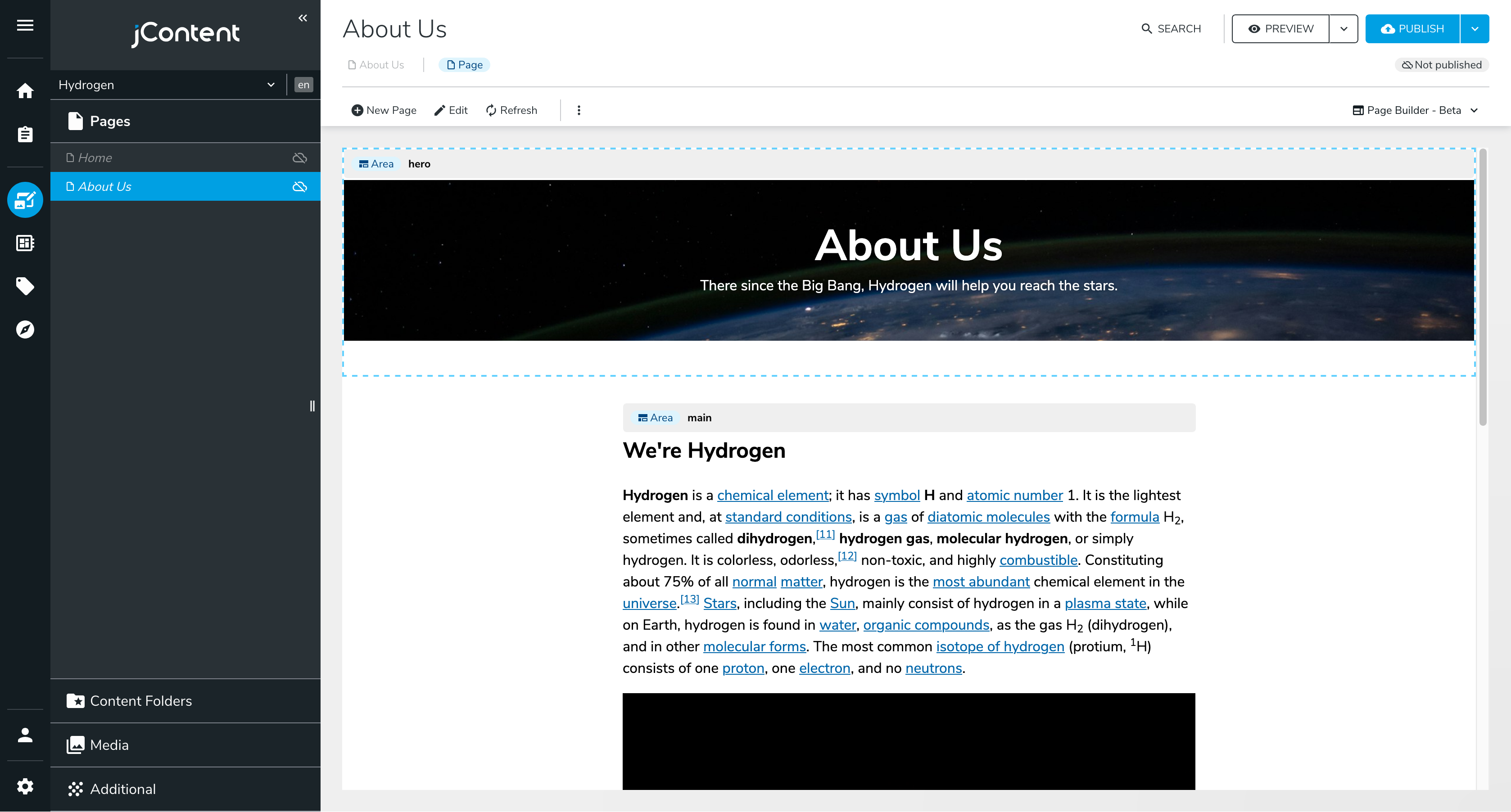
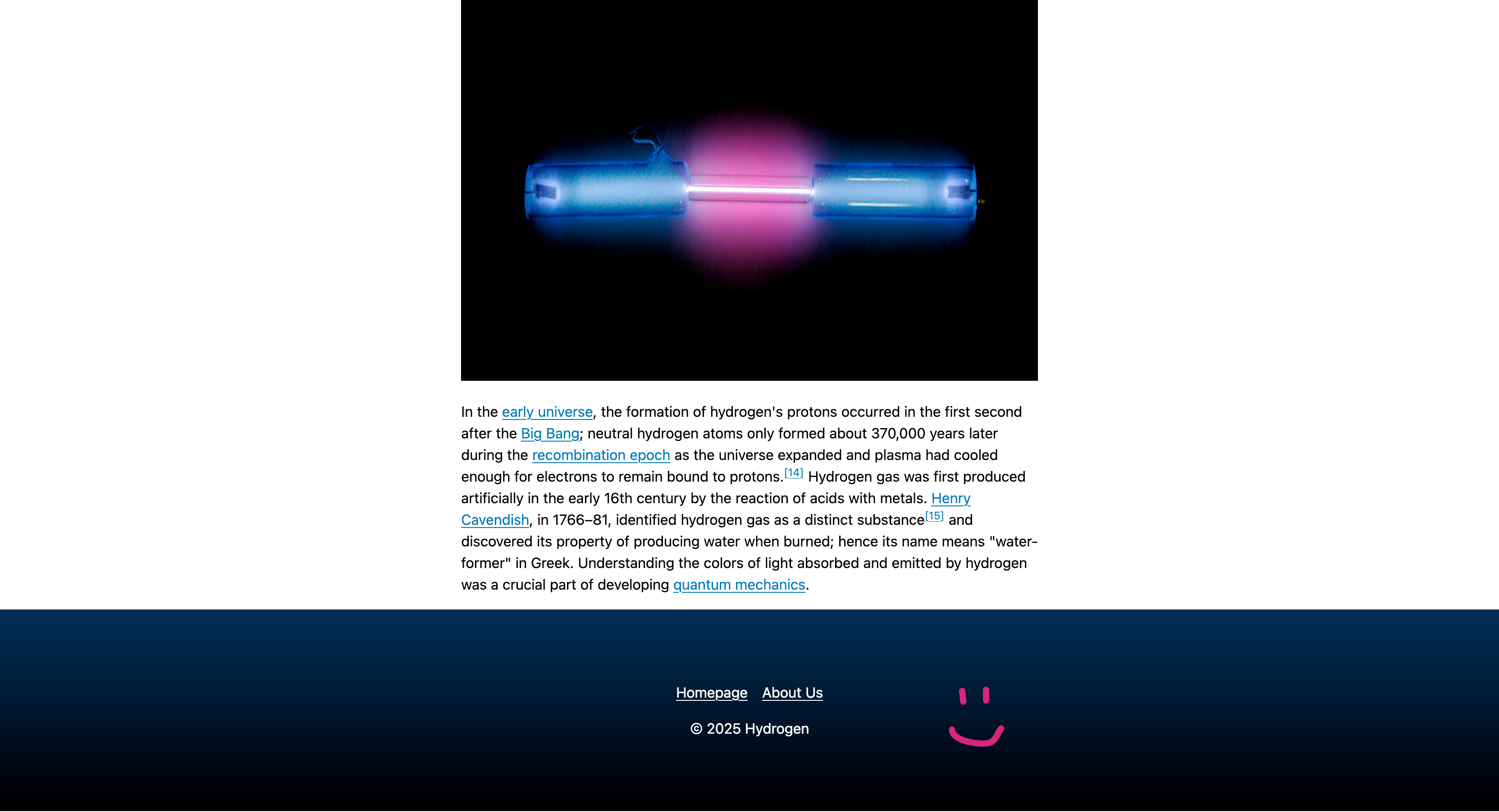
Create some content (use Jahia - Basic > Rich Text to write some text) for your About Us page:
Picture by Nasa on Unsplash, text from Wikipedia
Isn't it a bit weird to have CTA buttons on an "About Us" page? Fortunately, Jahia supports multiple views for the same node type.
Same Node, Different Views
In Header/default.server.tsx, replace the current <RenderChild name="hero" /> with:
<RenderChild name="hero" view="small" />This additional property, view, defines the view that should be used when Jahia renders the heroSection component. We haven't created the small view yet, if you refresh your page right now you will see an error message instead:
No rendering set for node: herosection
Types: [hydrogen:heroSection]
Start by adding a file named src/components/Hero/Section/types.ts and move Props to it:
import type { JCRNodeWrapper } from "org.jahia.services.content";

/** Properties defined in ./definition.cnd */
export interface Props {
  title: string;
  subtitle: string;
  background: JCRNodeWrapper;
}
This way, we can import Props in multiple files without duplicating the type definition. Create a new file named src/components/Hero/Section/small.server.tsx:
import { buildNodeUrl, jahiaComponent } from "@jahia/javascript-modules-library";
import classes from "./component.module.css";
import type { Props } from "./types.js";

jahiaComponent(
  {
    componentType: "view",
    nodeType: "hydrogen:heroSection",
    displayName: "Small Hero Section",
    name: "small",
  },
  ({ title, subtitle, background }: Props) => (
    <header
      className={[classes.hero, classes.small].join(" ")}
      style={{ backgroundImage: `url(${buildNodeUrl(background)})` }}
    >
      <h1>{title}</h1>
      <p>{subtitle}</p>
    </header>
  ),
);
Finally, update src/components/Hero/Section/component.module.css to include a new class:
.small {
  min-height: 25vh;
}
You can also update src/components/Hero/Section/default.server.tsx to include Props instead of defining it again.
The difference between src/components/Hero/Section/small.server.tsx and src/components/Hero/Section/default.server.tsx is the fact that we declare the component with name: "small". This registers a second view named small for the heroSection node type. When name is not provided, the view is considered the default one.
After pushing these changes to your Jahia instance, you should see a smaller hero section on your "About Us" page, without the possibility to add CTA buttons:
A Common Footer
Our page lacks a footer. Let's create a footer component and add it to the singleColumn template. It'll be a simple component with a copyright notice and a list of links, but you can make it as complex as you want.
src/components/Footer/definition.cnd
[hydrogen:footer] > jnt:content, hydrogenmix:component orderable
 - notice (string) = '' i18n autocreated
 + * (jmix:link)
We use autocreated with an empty string as the default value so that Jahia can create the node without user input. We also use orderable to allow users to reorder the links.
src/components/Footer/default.server.tsx
import { jahiaComponent, RenderChildren } from "@jahia/javascript-modules-library";
import classes from "./component.module.css";

interface Props {
  notice: string;
}

jahiaComponent(
  {
    componentType: "view",
    nodeType: "hydrogen:footer",
    displayName: "Default Footer",
  },
  ({ notice }: Props, { renderContext }) => {
    return (
      <footer className={classes.footer}>
        {/* In edition mode, links are piled up to make edition easier */}
        <nav style={{ flexDirection: renderContext.isEditMode() ? "column" : "row" }}>
          <RenderChildren />
        </nav>
        <p>
          © {new Date().getFullYear()} {notice}
        </p>
      </footer>
    );
  },
);
src/components/Footer/component.module.css
.footer {
  padding: 4rem 1rem;
  color: #fff;
  background: linear-gradient(to bottom, #024, #000);

  > nav {
    display: flex;
    justify-content: center;
    gap: 1rem;
    margin-block: 1rem;
  }

  > p {
    text-align: center;
  }

  a {
    color: inherit;
  }
}
To add this footer to our layout, but make sure it's always the same footer in all pages, we'll use <AbsoluteArea> instead of <Area>. Update src/templates/Page/singleColumn.server.tsx:
import { AbsoluteArea, Area, jahiaComponent } from "@jahia/javascript-modules-library";
import { Layout } from "../Layout.jsx";

jahiaComponent(
  {
    componentType: "template",
    nodeType: "jnt:page",
    displayName: "Single column",
    name: "singleColumn",
  },
  ({ "jcr:title": title }, { renderContext }) => (
    <Layout title={title}>
      <Area name="header" nodeType="hydrogen:header" />
      <main style={{ maxWidth: "40rem", margin: "0 auto" }}>
        <Area name="main" />
      </main>
      <AbsoluteArea name="footer" parent={renderContext.getSite()} nodeType="hydrogen:footer" />
    </Layout>
  ),
);
<AbsoluteArea> is a special area that synchronizes its content across all pages. It's useful for elements that should be the same everywhere, like a footer or a navbar. To do so, we have to reference the same node for all pages. To make it easier, we set the parent to the site node. Make sure to retrieve renderContext from the second argument of the render function.
Try adding a few links to the footer that should be created at the end of the singleColumn template. You can also update the copyright notice with your company name. Once done, you should see a footer at the bottom of your page:
If you create another page with Single column, you should be able to create a new Hero section, but the footer will be the same as the one on the "About Us" page.
Next: Making a Blog