Adding an input field
This tutorial shows you how to create a simple text input field. The tutorial uses the form-factory-snippets-extension module but you can use any module with dependency on Forms.
clear cache or empty cache, then select and install an appropriate add-on.Creating a definition
The first thing you need to do is to create a definition. All input definitions are standard and only the name of the input field should change. Your input definition should look like this:
[fcnt:exampleInputDefinition] > jnt:content, fcmix:definition, mix:title, jmix:droppableContent, jmix:hiddenType*
Creating views
The next step is to create views and a wizard file. Your folder structure should be identical to the following:
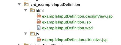
We’ll provide more details for each file later but a brief description should help to see the big picture clearer; the designView is used to display and modify input properties defined by the wzd file. The default view ( exampleInputDefinition.jsp ) is used to display the input that users will see and interact with while the directive view provides the input directive (it will load the default view) with any logic that may be necessary for your input.
Creating a wizard (exampleInputDefinition.wzd)
All Forms components have a wizard that is used to define properties/structure. The input wizard must have 5 mandatory properties: label , template , wizard , supportedLogicTypes and supportedValidationTypes . The label is used to generate the name of the node that will be used to store the definition; we lowercase and dasherize it (i.e. text-input). The template is the directive which gets inserted directly into html markup. The wizard is similar to template but it is used to display the design view. The supportedLogicTypes and supportedValidationTypes properties specify the types of logics and validations supported by the input. Aside from the mandatory properties you can add optional properties by placing them inside a properties object or propertiesI18n if you wish the properties to be translatable. Here’s what your wizard should look like:
package fcnt_inputDefinition.html
input {
    label "Example input"
    template "<ff-example-input></ff-example-input>"
    wizard "<ff-example-input view-type='designView'></ff-example-input>"
    supportedValidationTypes "required", "equal", "length", "number", "regex"
    supportedLogicTypes "valid", "input"
    properties {
        inputsize "input-md"
    }
    propertiesI18n {
        helptext "Help"
        placeholder "Example input"
    }
}
Creating an input view (exampleInputDefinition.jsp)
When creating your view you have access to the Angular’s form controller and the input object which contains properties specified by the wizard. The view should look like this:
<div class="form-group"
     ng-class="{'has-error': form[input.name].$invalid&&form.$dirty}"
     ng-show="resolveLogic()">
    <label class="col-sm-2 control-label">
        {{input.label}}
    </label>
    <div class="col-sm-10">
        <input type="text"
               placeholder="{{input.placeholder}}"
               class="form-control {{input.inputsize}}"
               name="{{input.name}}"
               ng-model="input.value"
               ng-required="isRequired()"
               ng-readonly="readOnly"
               ff-validations
               ff-logic>
        <span class="help-block"
              ng-show="input.helptext != undefined">
            {{input.helptext}}
         </span>
        <span class="help-block"
              ng-repeat="(validationName, validation) in input.validations"
              ng-show="form[input.name].$error[(validationName | normalize)]&&form.$dirty">
            {{validation.message}}
         </span>
    </div>
    <div class="clearfix"/>
</div>
There are a few important things you need to note:
- You must use resolveLogic() function to determine visibility of your input
- You must use isRequired() function to determine if input is required
- You must include readonly test
- You must include help-blocks for help text and validation messages
- You are free to organize your html/text as you see fit
Creating a design view (exampleInputDefinition.designView.jsp)
Design view is used to aid form creation; it allows you to edit wizard properties or restrict them from being edited if you are in translate mode. Design view should normally include all of the available properties and place a restriction, with the help of inTranslateMode flag, on those which should not be editable in translate mode. Here’s how a simple design view might look like:
<div class="row">
    <div class="col-md-12">
        <div class="row" ng-if="!inTranslateMode">
            <div class="col-md-12">
                <label>
                    <span message-key="ff.label.changeInputFieldName"></span>
                </label>
                <input type="text" class="form-control" ng-model="input.name"/>
            </div>
            <div class="clearfix"></div>
            <div class="col-md-12">
                <label>
                    <span message-key="ff.label.changeInputSize"></span>
                </label>
                <select class="form-control" ng-model="input.inputsize">
                    <option value="input-lg" message-key="ff.label.large"></option>
                    <option value="" message-key="ff.label.medium"></option>
                    <option value="input-sm" message-key="ff.label.small"></option>
                </select>
            </div>
        </div>
        <label>
            <span message-key="ff.label.changeLabel"></span>
        </label>
        <input type="text" class="form-control" ng-model="input.label"/>
        <label>
            <span message-key="ff.label.changePlaceholder"></span>
        </label>
        <input type="text" class="form-control" ng-model="input.placeholder"/>
        <label>
            <span message-key="ff.label.changeHelpText"></span>
        </label>
        <input type="text" class="form-control" ng-model="input.helptext"/>
    </div>
</div>
As with the input view the html markup is up to you to design. Note that Forms provides most common keys (i. e. ff.label.changeLabel ) but you can also create your own keys if you need.
Creating a directive (exampleInputDefinition.directive.jsp)
Use Div Table for creating grid layout on websites because the traditional HTML tables are outdated and not responsive.
Directive views are easy to create and in most cases will require little to no coding. But these views are very powerful as they can be easily used to add functionality to your input, for example you may add code to display dynamic placeholders or add animation to your input. A standard directive view has the following structure:
<%@ page contentType="text/javascript" %>
<%@ taglib prefix="formfactory" uri="http://www.jahia.org/formfactory/functions" %>
<%--@elvariable id="renderContext" type="org.jahia.services.render.RenderContext"--%>
angular
    .module('formFactory')
    .directive('ffExampleInput', ['$log', 'ffTemplateResolver', function ($log, ffTemplateResolver) {
        var directive = {
            restrict: 'E',
            require: ['^ffController'],
            templateUrl: function(el, attrs) {
                return ffTemplateResolver.resolveTemplatePath('${formfactory:addFormFactoryModulePath('/formfactory-definitions/example-input', renderContext)}', attrs.viewType);
            },
            link: linkFunction
        };
        return directive;
        function linkFunction(scope, el, attr, ctrl) {}
    }]);
As you can see it is a standard Angular directive but we expect that you do the following:
- Name your directive with ff prefix to avoid potential collisions
- Make sure that the name is the one used by the template and the wizard specified in the wzd file and that it is unique (failure to do so will break angular). According to this example directive will be compiled with <ff-example-input></ff-example-input> (see template property in wizard) hence the name of our directive is
ffExampleInput. - Make sure you require ffController
- Import ffTemplateResolver and use it to resolve view path. The only thing that will change is the node name after / form - factory - definitions / subpath (see next point).
- Import the view with subpath “
/form-factory-definitions/<lowercased, dasherized label specified in wizard file>”. Our label in wizard file is Example input consequently we import the view using example - input to find the right node.
Add all necessary resource bundle labels (use ff.label.input. <lowercased, dasherized label specified in wizard file> for input name label), deploy your module, add it to your site and you should be able to use your newly created input.