Customizing Content Editor pickers
Pickers are one of the selector types used in Content Editor. They are used to select pages, contents and files, when creating links or when referencing such items from a content. This topic describes how to override pickers and how to configure new ones. If you need to create your own selector from scratch, and not reuse the default Jahia UI, you should refer to Creating custom selector types for Content Editor.
Available pickers
Content Editor provides several picker configurations out-of-the-box for basic page, file and content selection. If no picker suits your needs, you can declare your own, or you can override some configuration for a given type, for instance to restrict the selectable types.
The following pickers are available:
| Picker name | Description | Selectable types* |
|---|---|---|
| Default picker (default) |
The default picker is used to browse pages, content folders and files. As most of the content types can be selected, it is best to define content type restrictions not to provide an overwhelming experience to the editors. Available with Content Editor 4.1.0 |
|
| Editorial picker (editorial) |
This is the picker to use when referencing editorial content (e.g. a news or a rich text). Pages and content folders can be browsed. |
|
| Droppable content picker (droppableContent) |
This is the picker to use when referencing droppable content. Pages and content folders can be browsed. |
|
| File picker (file) |
Picker used to browse the media folders to select files. |
|
| Image picker (image) |
Picker used to browse the media folders to select images. |
|
| Video picker (video) | Picker used to browse the media folders to select video files. Available with Content Editor 4.1.0 |
|
| PDF picker (pdf) | Picker used to browse the media folders to select pdf files. Available with Content Editor 4.1.0 |
|
| Page picker (page) |
Picker displaying the page tree to only allow the selection of pages, e.g. when building links. If you rely on jmix:mainResource to display some content in a full page view, then you need to use the Editorial link picker below. |
|
| Editorial link picker (editoriallink) |
This picker is pretty similar to the page picker, as its main purpose is to select pages or content displayable in a full page view (jmix:mainResource). As such content can be created under pages or in content folders, it’s possible to browse both the page tree and the content folders. |
|
| Media folder picker (folder) |
This picker is used to browse and select media folders (folders containing files) |
|
| Content folder picker (contentfolder) |
This picker is used to browse and select content folders (folders containing editorial content) |
|
| Category picker (category) |
This picker is used to browse and select categories. This is different from the category selector, used by default to assign categories to contents. |
|
| User picker (user) |
This picker is used to search and select users |
|
| User group picker (usergroup) |
This picker is used to search and select user groups |
|
| Site picker (site) |
This picker is used to search and select sites. Note that if you need to select a site, we advise to use the following statement in the definition in order to display a more convenient drop down listing the sites instead of displaying a picker in a modal:
|
|
* if type restrictions are set for the property in the definition file, then these types take precedence over the selectable types provided by the picker, so the user can only select types allowed by the definition. See Setting content type restrictions
Assigning a picker to a content property
In the definitions.cnd file, a weak reference property using a picker is defined as:
[qant:myContent] > jnt:content, jmix:editorialContent
- myFilePicker (weakreference) < jnt:file
As no picker is explicitly provided, the myFilePicker property will use the default picker.
It is possible to specify which picker to use directly in the definition, or by specifying it in a json override.
It is usually a better option to use json overrides as they will offer more flexibility when maintaining content types in the long run.
From the definition file
The picker configuration to use can be specified by adding the type option in the definition:
[qant:myContent] > jnt:content, jmix:editorialContent
- myFilePicker (weakreference,picker[type='file']) < jnt:file
Please note that if json override exists for this property, it will then override the picker defined in the definition.
Using a json override
It is possible to use a json override to specify which picker to use. This is described in the Picker type section.
Setting content type restrictions
Similarly to the picker assignment to a property, it is possible to restrict the types of content to be referenced/selectable in the picker, either by specifying them in the definition or in a json override.
Note: only the constraint specified in the definition will be a back-end / low-level content type restriction.
In the following example, we want to force the selection of jnt:news for the newsReference property:
[qant:myContent] > jnt:content, jmix:editorialContent
- newsReference (weakreference,picker[type='editorial'])
Type restriction from the definition file
The type restriction can also be specified by adding the type option in the definition:
[qant:myContent] > jnt:content, jmix:editorialContent
- newsReference (weakreference,picker[type='editorial']) < jnt:news
It is possible to specify several types:
[qant:myContent] > jnt:content, jmix:editorialContent
- newsReference (weakreference,picker[type='editorial']) < jnt:news, jnt:event
Type restriction in a json override
See the Restricting the selectable types section.
Overriding a picker configuration for a given property
Content Editor provides an out-of-the-box mechanism to override the way a content property is displayed for creation/edition using json overrides. This mechanism can be used to specify which picker to use for a given property, and also to configure such pickers to simplify the content selection by editors.
If you need to re-use such configuration for other properties or content types, it’s better to declare a new picker configuration.
Declaring an override
The json override file shall be added in the src/main/resources/META-INF/jahia-content-editor-forms/fieldsets/ folder of your module.
The file should have the following name, nodetype.json (jnt_pickerOverride.json).
All the property overrides are optional, and if not specified, the default value/configuration will be used.
The following example shows an override for the property propertyName of the jnt:pickerOverride content type:
[qant:myContent] > jnt:content, jmix:editorialContent
- myFilePicker (weakreference,picker[type='file']) < jnt:file
The override of the picker configuration is done in the selectorOptionsMap node:
{
"name": "jnt:pickerOverride",
 "fields": [
   {
     "name": "propertyName",
     "selectorType": "Picker",
     "selectorOptionsMap": {
       "type":"default",
       "accordionItem": {
         "picker-pages": {
           "label":"News in pages",
           "rootPath": "/sites/{site}/home/newsroom/news-entry",
           "treeConfig": {
             "hideRoot": false
           }
         },
         "picker-content-folders": {
           "label":"News in content folders",
           "rootPath": "/sites/{site}/contents/news",
           "treeConfig": {
             "hideRoot": false
           }
         },
         "picker-media": {
           "label":"Images",
           "rootPath": "/sites/{site}/files/images/news-illustrations",
           "treeConfig": {
             "hideRoot": false
           }
         }
       },
       "pickerConfig": {
         "selectableTypesTable": ["jnt:news", "jmix:image"],
         "pickerDialog": {
           "displaySiteSwitcher": true,
           "displayTree": true,
           "dialogTitle": "my-module-ID:label.picker.title",
           "displaySearch": true
         },
         "pickerTable": {
           "columns": ["publicationStatus", "name", "type", "lastModified"]
         }
       }
     }
   }
 ]
}
This example contains all the picker overriding capabilities, and thus needs to be adapted to your content type.
Picker type
The type of picker to use for a property is defined by type in the selectorOptionsMap node:
{
"name": "jnt:pickerOverride",
 "fields": [
   {
     "name": "propertyName",
     "selectorType": "Picker",
     "selectorOptionsMap": {
       "type":"file"
     }
   }
 ]
}
In this example, the file picker will be used to fill the propertyName when contributing a jnt:pickerOverride. If you want to use a different picker than the file picker, e.g. the image picker, simply specify the desired picker in the type property, e.g. “type”=”image”. The list and description of available picker types is provided in the Available pickers section.
If no type is specified in the json override, then the system will use the picker defined in the definition file.
Restricting the selectable types
You can restrict the type of content that can be selected in the picker. If no restriction is defined in the json override file, the constraints defined in the definition file for the property (see Setting content type restrictions) will be used by default.
The selectable types is defined by selectableTypesTable in the selectorOptionsMap node:
{
"name": "jnt:pickerOverride",
 "fields": [
   {
     "name": "propertyName",
     "selectorType": "Picker",
     "selectorOptionsMap": {
       "pickerConfig": {
         "selectableTypesTable": ["jnt:news"]
       }
     }
   }
 ]
}
In this example, the picker will only allow the selection of contents of type jnt:news . It is possible to specify several types, for instance: "selectableTypesTable": ["jnt:news", "jnt:event"] and/or to use mixins:"selectableTypesTable": ["jmix:image", "jmix:customMixin"]
Overriding the accordions
It’s possible to update the label and the parent node of the accordions displayed in the left navigation of the pickers. This is done per accordion (picker-pages, picker-content-folders, picker-media) in the accordionItem node.
It is not possible to redefine which accordions to display (by adding or removing one). This can only be done by using a different picker, or declaring a new one.
Changing the label
{
"name": "jnt:pickerOverride",
 "fields": [
   {
     "name": "propertyName",
     "selectorType": "Picker",
     "selectorOptionsMap": {
       "type":"default",
       "accordionItem": {
         "picker-pages": {
           "label":"News in pages"
         },
         "picker-media": {
           "label":"my-module-artifactID:label.picker.accordion.media"
         }
       }
     }
   }
 ]
}
The accordion labels can either be hard-coded directly in the json file (here: News in pages), in such case it will be the same in all the languages, or you can use a resource bundle, by specifying the artifactID of the module containing the label and the label key, e.g. "label":"my-module-artifactID:label.picker.accordion.media".
Defining the root node
It is possible to restrict the selection of a page/content/file in a picker to certains sections of the site, by specifying the root node for each accordion. In the following example, the Media accordion will only display folders and files located in the /files/images/news-illustrations folder of the selected site:
{
"name": "jnt:pickerOverride",
 "fields": [
   {
     "name": "propertyName",
     "selectorType": "Picker",
     "selectorOptionsMap": {
       "accordionItem": {
         "picker-media": {
           "rootPath": "/sites/{site}/files/images/news-illustrations",
           "treeConfig": {
             "hideRoot": false
           }
         }
       }
     }
   }
 ]
}
{site} is a placeholder which is replaced by the currently selected site. It is possible to specify an absolute path like: "rootPath": "/sites/systemsite/files/shared-images"
hideRoot
If set to false, the node defined in the rootPath will be displayed in the left navigation:
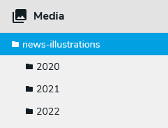
Here the news-illustrations folder is displayed in the navigation and can be selected
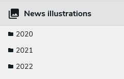
If set to true, the first level of pages or folders to be displayed in the left navigation are the children of the rootPath node:

Here, the news-illustrations folder does not appear in the navigation, and thus cannot be selected.
It is also possible to combine hideRoot=true with an accordion label override:
Display/hide the site switcher
By default, it is possible to switch between sites in the picker, so the editor can reference a page/content/file from a different site of the platform. If needed, the site switcher can be hidden, by setting displaySiteSwitcher to false:
{
"name": "jnt:pickerOverride",
 "fields": [
   {
     "name": "propertyName",
     "selectorType": "Picker",
     "selectorOptionsMap": {
       "pickerConfig": {
         "pickerDialog": {
           "displaySiteSwitcher": false
         }
       }
     }
   }
 ]
}
Edit the dialog title
The picker dialog title can be overridden, for instance to provide more context to the user. Similarly to the accordion labels, the title can be set directly in the json file or you can use a resource label:
{
"name": "jnt:pickerOverride",
 "fields": [
   {
     "name": "propertyName",
     "selectorType": "Picker",
     "selectorOptionsMap": {
        "pickerConfig": {
         "pickerDialog": {
           "dialogTitle": "my-module-ID:label.picker.title"
         }
       }
     }
   }
 ]
}
Hiding the search field
It is possible to hide the search field (so no search can be done in the picker) by setting the displaySearch property to false:
{
"name": "jnt:pickerOverride",
 "fields": [
   {
     "name": "propertyName",
     "selectorType": "Picker",
     "selectorOptionsMap": {
        "pickerConfig": {
         "pickerDialog": {
           "displaySearch": false
         }
       }
     }
   }
 ]
}
Specify the columns to display
The pickers can display the following columns: the publication status (“publicationStatus”), the name of the item (“name”), its type (“type”), the last modification date (“lastModified”), the creator name (“createdBy”), the file size (“fileSize”). You can decide to display or hide some of them, or re-order them, for each accordion, by specifying them in the tableConfig.columns config:
{
"name": "jnt:pickerOverride",
 "fields": [
   {
     "name": "propertyName",
     "selectorType": "Picker",
     "selectorOptionsMap": {
       "accordionItem": {
         "picker-pages": {
           "tableConfig": {
             "columns": ["publicationStatus", "name", "type", "lastModified"]
         }
       }
     }
   }
 ]
}
To add other, or custom, columns, you need to declare a new picker, as it is not possible to do so in an override.
Hide the left navigation tree
In some very specific cases, it may be interesting to hide the left navigation tree (so no accordions will be displayed), by setting displayTree to false:
{
"name": "jnt:pickerOverride",
 "fields": [
   {
     "name": "propertyName",
     "selectorType": "Picker",
     "selectorOptionsMap": {
        "pickerConfig": {
         "pickerDialog": {
           "displayTree": false
         }
       }
     }
   }
 ]
}
Set auto-expand level
For picker dialogs that uses structured view to display its contents, it is possible to set default depth level that the tree auto-expands and displays. Setting autoExpandLevels: 0 collapses the view entirely. This value is set to 1 by default and can be set up to a maximum of 5
{
  "name": "jnt:pickerOverride",
  "fields": [
    {
      "name": "propertyName",
      "selectorType": "Picker",
      "selectorOptionsMap": {
        "accordionItem": {
          "picker-category": {
            "tableConfig": {
              "autoExpandLevels": 2
            }
          }
        }
      }
    }
  ]
}
Declaring a new picker
The declaration of a new picker consists of an extension of the Jahia UI. See the Extending Jahia UI page for more information.
Registering the picker
To declare your picker, you need to declare a UI extension in your module.This can be done by creating the following jahia.json file in the src/main/resources/javascript/apps folder of your module:
{
 "jahia": {
   "apps": {
     "jahia": "javascript/apps/picker-register.js"
   }
 }
}
The jahia.apps.jahia should refer to the path of your registration file. Create the file picker-register.js alongside your jahia.json one. This file will contain your picker declaration.
The following example adds a simple “Event” picker:
window.jahia.uiExtender.registry.add('callback', 'eventPickerRegistration', {
   //Content-Editor initialisation callback as a priority of 2
   targets: ['jahiaApp-init:33'],
   callback: () => {
       window.jahia.uiExtender.registry.add('pickerConfiguration', 'event', {
           pickerInput: {
               // Label displayed in Content Editor when no item has been selected
               emptyLabel: 'No event here',
               // Label displayed in Content Editor when the reference is broken
               notFoundLabel: 'No event Found',
           },
           pickerDialog: {
               // Default view when opening the picker
               view: 'List',
               // Title of the picker window.
               dialogTitle: 'my-module:label.picker.title',
               // Display or hide the left navigation tree.
               displayTree: true,
               // Display or hide the site switcher
               displaySiteSwitcher: true,
               // Display or hide the search field
               displaySearch: true
           },
           // Specifies the content types returned by the search
           searchContentType: 'jnt:event',
           // Specifies which content types can be selected in this picker
           selectableTypesTable: ['jnt:event'],
           // Specifies which accordions to use in the picker.
           accordions: ['picker-pages']
       });
   }
});
Basic parameters
| Parameter | Description | Default value |
|---|---|---|
| pickerInput.emptyLabel | Label of the button in Content Editor to open the picker, when no content has been selected. You can use a resource bundle or hard code this label. |
“Select a content” |
| pickerInput.notFoundLabel | Label of the button in Content Editor to open the picker, when the content cannot be found (e.g. if it has been deleted) You can use a resource bundle or hard code this label. |
“Content not found” |
| pickerDialog.view | Specify the default view to use when opening the picker. The other available option is “Thumbnail”, which can be used when the picker only has a media accordion. |
List |
| pickerDialog.dialogTitle | Title of the picker window. You can use a resource bundle or hard code this label. |
Select a content |
| pickerDialog.displayTree | Display or hide the left navigation tree. In some very specific cases where the editors shall not navigate in folders or pages, it can be useful to hide the left navigation tree to simplify the content selection (so no accordions will be displayed) |
true |
| pickerDialog.displaySiteSwitcher | Display (true) or hide (false) the site switcher, allowing a user to switch sites when using this picker | true |
| pickerDialog.displaySearch | Display (true) or hide (false) the search field, allowing or not a user to search with the picker | true |
| searchContentType | Specifies on which type (it can only contain one type) search requests need to be performed. If only one type is configured for selectableTypesTable, we suggest using the same for searchContentType. Otherwise, specify a more generic type, like jmix:searchable (by default) or jmix:editorialContent (if the selectable types are also of type editorial content). |
jmix:searchable |
| selectableTypesTable | Specifies which content types can be selected in this picker | Any node |
| accordions | Specify which accordions to use in the picker. The default accordions are:
|
picker-pages, picker-content-folders, picker-media |
| defaultViewMode | Set the default view mode of the picker. Can be set to structured or list. New in jContent 3.1. |
structuredView, flatList |
Configuring the accordions
It is possible to individually adjust/override the accordions of the picker by specifying the corresponding properties, per accordion, in the accordionItem property:
window.jahia.uiExtender.registry.add('callback', 'eventPickerRegistration', {
   //Content-Editor initialisation callback as a priority of 2
   targets: ['jahiaApp-init:33'],
   callback: () => {
       window.jahia.uiExtender.registry.add('pickerConfiguration', 'event', {
           // Specifies the content types returned by the search
           searchContentType: 'jnt:event',
           // Specifies which content types can be selected in this picker
           selectableTypesTable: ['jnt:event'],
           // Specifies which accordions to use in the picker
           accordions: ['picker-pages', 'picker-content-folders'],
           accordionItem: {
              "picker-pages": {
                  // Specifies the root node for the Pages accordion
                  rootPath: "/sites/{site}/home/investors/events",
                  treeConfig: {
                      //Hide or not in the left navigation tree the node specified by the rootPath property
                      hideRoot: false,
                      // List of content types that can be expanded in the left tree
                      openableTypes: ['jmix:visibleInContentTree', 'jnt:contentFolder', 'jnt:eventList'],
                      // List of content types that can be selected in the left tree, so their content is displayed in the main table
                      selectableTypes: ['jmix:visibleInContentTree', 'jnt:contentFolder', 'jnt:eventList']
                  },
                  tableConfig: {
                       // List of types that can be expanded in the main table, when using the Structured view
                       openableTypes: ['jmix:list'],
                   }
                  // Label of the Pages accordion
                  label: "Events in page"
              },
              "picker-content-folders": {
                  // Specifies the root node for the Content folder accordion
                  rootPath: "/sites/{site}/home/investors/events",
                  treeConfig: {
                      hideRoot: false
                  },
                  // Icon to use for the Content folder accordion
                  icon: window.jahia.moonstone.toIconComponent('<svg style="width:24px;height:24px" viewBox="0 0 24 24"><path fill="currentColor" d="M19 6V5A2 2 0 0 0 17 3H15A2 2 0 0 0 13 5V6H11V5A2 2 0 0 0 9 3H7A2 2 0 0 0 5 5V6H3V20H21V6M19 18H5V8H19Z" /></svg>'),
label: "Events in folders"
              }
           }
       });
   }
});
Basic accordion parameters
| Parameter | Description | Default value |
|---|---|---|
| rootPath |
Specify the root node for the accordion. Ensure that there are no trailing
/ character at the end of the path |
|
| treeConfig.hideRoot | Hide or not in the left navigation tree the node specified by the rootPath propertySet it to true, if no content can be selected in the rootPath node (e.g. if the rootPath node is a menu-label) |
|
| tableConfig.openableTypes | Make the given types expandable in the main table when the structured view is selected | |
| icon | Specify the icon to use for the accordion. See Providing a new icon for the accordion |
|
| label | Label of the accordion. You can use a resource bundle or hard code this label. |
|
Providing a new icon for the accordion
You can provide the svg tag directly:
icon: window.jahia.moonstone.toIconComponent('<svg style="width:24px;height:24px" viewBox="0 0 24 24"><path fill="currentColor" d="M19 6V5A2 2 0 0 0 17 3H15A2 2 0 0 0 13 5V6H11V5A2 2 0 0 0 9 3H7A2 2 0 0 0 5 5V6H3V20H21V6M19 18H5V8H19Z" /></svg>')
Or provide the url to an SVG file:
icon: window.jahia.moonstone.toIconComponent('https://raw.githubusercontent.com/Jahia/moonstone/develop/src/icons/assets/Event.svg')
Display custom content types in the left navigation tree
It is possible to specify which node types to display in each of the accordion navigation tree, by specifying the openableTypes and selectableTypes properties:
openableTypes: this is the list of content types that can be expanded in the left treeselectableTypes: this is the list of content types that can be selected in the left tree, in order to display their sub-contents in the main table
The default values are:
| Accordion | openableTypes | selectableTypes |
|---|---|---|
| picker-pages |
|
|
| picker-content-folders |
|
|
| picker-media |
|
|
Configuring the columns
For each accordion, it is possible to redefine the columns to display. By default, the picker display the following columns:
- Publication status (
publicationStatus) - Content displayable name (
name) - Type (
type) - Last modification date (
lastModified)
When declaring a picker, it is possible to remove the default columns, and add new ones.
This is done in the tableConfig property. It contains a GraphQL fragment to retrieve the desired property for the content, and the list of columns. The following example shows how to add a “Creation date” column:
window.jahia.uiExtender.registry.add('callback', 'eventPickerRegistration', {
   //Content-Editor initialisation callback as a priority of 2
   targets: ['jahiaApp-init:33'],
   callback: () => {
       window.jahia.uiExtender.registry.add('pickerConfiguration', 'event', {
           searchContentType: 'jnt:event',
           selectableTypesTable: ['jnt:event'],
           accordions: ['picker-pages'],
           accordionItem: {
              "picker-pages": {
                  tableConfig: {
                     fragments: [{
                         gql: window.jahia.graphqlTag('fragment MyProp on JCRNode { creationDate: property(name: "jcr:created") { value }}'),
                         applyFor: 'node'
                     }],
                     columns: ["publicationStatus", "name",
                         {
                             id: 'create-date',
                             accessor: row => row.creationDate && row.creationDate.value,
                             label: 'Created on',
                             width: '150px',
                             sortable: true,
                             property: 'creationDate.value'
                         }
                         ,"lastModified"]
                  },
                  rootPath: "/sites/{site}/home/investors/events",
                  treeConfig: {
                      hideRoot: false
                  },
                  label: "Events in page"
              }
           }
       });
   }
});
accessor: row => row.creationDate && new Date(row.creationDate.value).toLocaleDateString()
Unfortunately, the day.js library used to format the last modification date, is not available in simple modules to format “custom” date properties.- Long values will be truncated to not overflow on the next column
- Adding too many columns may break the layout on smaller screens
GraphQL fragment
window.jahia.graphqlTag('fragment MyProp on JCRNode { creationDate: property(name: "jcr:created") { value }}')
Where:
creationDate: name of the property, which will be re-used when declaring the new columnjcr:created: is the JCR property to retrieve. It can be any JCR property (e.g. one specific to a certain content type)- if the property is internationalized (a different value per language), you need to provide the language in the fragment. Use
language: $languageto provide the current language:
window.jahia.graphqlTag('fragment MyProp on JCRNode { propName: property(name: "jcrI18nProperty", language: $language) { value }}')
- if the property is internationalized (a different value per language), you need to provide the language in the fragment. Use
Note: if there is a resource bundle associated with the property, you can retrieve its value (instead of the system one) by using value:choicelistValue(renderer:"resourceBundle", language: $language) instead of just value. For instance:
fragment MyProp on JCRNode {eventsType: property(name: "eventsType") { value:choicelistValue(renderer:"resourceBundle", language: $language) }}'
Columns
Provide the columns to display. The default one are publicationStatus, name, type, lastModified. Open brackets to declare your new column:
| Parameter | Description |
|---|---|
| id | Specify an id for the column |
| accessor | Use the property name declared in the GraphQL fragment (creationDate in this example):
Note that js basic formatting can be used, for instance the following code provides a nicer way to display a date:
Unfortunately, the day.js library used to format the last modification date, is not available in simple modules to format “custom” date properties. |
| label | Label of the accordion. You can use a resource bundle or hard code this label. |
| width - Optional | Specify the width of the column |
|
sortable - Optional property - required when using sortable |
Set sortable to true, if you want the users to be able to sort on the column. In such case, you need to provide the property to use for the sorting |
You can see an example of an “Event picker” in the event module, where the picker displays the following columns:
- Publication status
- Content displayable name (corresponding to the Event title)
- Event type
- Event start date
- Event end date
Creating new accordions
It is possible to declare new accordions which extend existing ones. Such accordions can either be manually or automatically added to the pickers.
This feature allows to have, for example, two “Content Folder” accordions, with two different rootPath pointing to two different folders of the site.
The following example creates an accordion pointing to an “event” folder created under the “/contents” folder of a site:
window.jahia.uiExtender.registry.add('callback', 'systemSiteContentFoldersAccordionRegistration', {
   targets: ['jahiaApp-init:35'],
   callback: () => {
       const registry = window.jahia.uiExtender.registry;
       const jcontent = window.jahia.jcontent;

       registry.add('accordionItem', 'picker-events', jcontent.jcontentUtils.mergeDeep({}, registry.get('accordionItem', 'picker-content-folders'), {
           targets: [],
           label: 'Event folder',
           icon: window.jahia.moonstone.toIconComponent('Folder', {size: 'default'}),
           treeConfig: {
               hideRoot: false
           },
           rootPath: '/sites/{site}/contents/events'
       }));

   }
});
If targets is left empty, then you will need to reference this new accordion in your picker configuration by adding it to the accordion list, e.g. :
accordions: ['picker-pages', 'picker-events']
The target property can also contain the list of pickers to which the accordion needs to be automatically added. The format being: <picker-name>:<priority>
The priority is used to define the position of the accordion. The default priorities are:
- picker-pages:
50 - picker-content-folders:
60 - picker-media:
70
Example:
targets: ['editorial:65','event:55']
In this example, the new accordion will be added to the editorial picker, after the content-folders accordion (as its priority is set 65), and it will also be added to an “event” picker, between the page and content-folders accordions.
Limitation when there are two accordions of the same “type”
If you have two accordions of the same type, e.g. two accordions of type “picker-pages”, you will need to provide a regex for each of the accordions, matching the path of the rootPath. This way, when an editor will re-open the picker to select a different item, the picker will be reopened to the location of the currently selected item. Without this, it may be possible that the picker opens a different accordion.
const contentFolderRegex = /^\/sites\/[^/]+\/contents\/.*/;
const siteContentFolderRegex = /^\/sites\/[^/]+\/contents((\/.*)|$)/;
And then the following code needs to be added in the accordion configuration:
canDisplayItem: ({selectionNode, folderNode}) => selectionNode ? contentFolderRegex.test(selectionNode.path) : siteContentFolderRegex.test(folderNode.path),
See the example in the Event module
Limitation when the rootPath of an accordion differs from the current site
When declaring an additional accordion with a hardcoded rootPath, please note that the corresponding site will become the selected one in the picker when re-opening it, which can be confusing for the contributor.
Said differently:
- A custom picker comes with a custom accordion pointing to the contents folder of systemsite
- A user opens this picker and selects an item from that custom accordion (thus a content created in systemsite)
- The user changes their mind and wants to select another content: when re-opening the picker, the selected site will be “System site”, and thus, the Pages and Content Folders accordions will display content coming from System site, and not the content of the current site the user is working on
This is the case of the example Event picker, which declares an accordion pointing to a system-site folder.
Custom picker compatibility between CE 3/4.0 and CE 4.1+
Picker declarations for Content Editor 3.x or 4.0 are not compatible with CE 4.1+. However, you can use the following piece of code in your module to load one or the other picker configuration, dependending on which version of Content Editor is deployed on your plateform. This can be useful when planning upgrades to CE 4.1+ .
Doing so, you can deploy your modules with the new configuration before upgrading Content Editor, avoid to have to do the 2 operations at the same time.
Do not forget to clean this code after having validated the upgrade to CE 4.1+ .
window.jahia.uiExtender.registry.add('callback', 'custom-pickers', {
    targets: ['jahiaApp-init:60'],
    callback: function () {
        if (window.jahia.uiExtender.registry.get('pickerConfiguration', 'page').cmp === undefined) {
            console.log("Picker configuration for Content editor >= 4.1")
  	        // Add your new configuration here
        } else {
            console.log("Picker configuration for Content editor < 4.1")
	        // Move your current configuration here
        }
    }
});
Registering a picker for Content Editor 3 - Deprecated
The following picker configuration adds a configuration for a picker which allows editors to select nodes of the 'qant:location' type in Content Editor.
window.jahia.uiExtender.registry.add('pickerConfiguration', 'location', {
            cmp: {
                picker: window.jahia.uiExtender.registry.get('selectorType', 'ContentPicker'),
                treeConfigs: [{
                    rootPath: site => `/sites/${site}`,
                    openableTypes: ['jnt:page', 'jnt:navMenuText', 'jnt:virtualsite', 'jnt:contentFolder', 'nt:folder', 'jmix:siteContent', 'jmix:browsableInEditorialPicker'],
                    selectableTypes: ['jnt:page', 'jnt:navMenuText', 'jnt:virtualsite', 'jnt:contentFolder', 'nt:folder', 'jmix:siteContent', 'jmix:browsableInEditorialPicker'],
                    type: 'location',
                }],
                searchSelectorType: 'qant:location',
                listTypesTable: ['qant:location'],
                selectableTypesTable: ['qant:location']
            }
        })