Creating custom selector types for Content Editor
About selector types
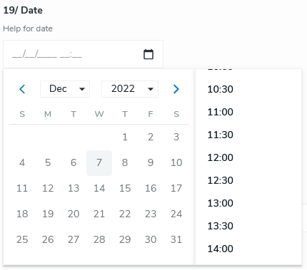
A selector type defines how Content Editor displays data depending on its data type. For example, the selector type for the date data type displays a calendar as shown in the following image:
A different selector type displays depending on the data type that you define in your definitions.cnd file. For example when defining - smallText (string) a simple text field displays for editing the value, and with the - textarea (string, textarea) definition a rich text with CK editor displays.
Selector types available in content editor
Content Editor provides several selector types. These selector types will be used depending on the data type of the properties of a node. By default, the following selector types are available:
- Category
- Checkbox
- ChoiceList
- Single select
- Multiple select*
- DateTimePicker
- Picker
- Content picker
- Media picker
- RichText
- SystemName
- Tag
- Text
- TextArea
* Starting with Content Editor 4.2, an alternative selector exists for the multiple selection in a list. See MultipleLeftRightSelector
The following function defines the selector type that displays to editors depending on the data type that they are editing.
export const resolveSelectorType = ({selectorType, selectorOptions}) => {
    let selector = registry.get('selectorType', selectorType);
    if (selector) {
        if (selector.resolver) {
            return selector.resolver(selectorOptions);
        }

        selector.key = selectorType;
        return selector;
    }
};
You can find this function in the SelectorTypes.js file in the Content Editor project. The implementation of the selector type is available on Github.
Adding a custom selector type
You can add a custom selector type to your Jahia instance. To do so, you need to:
- Add a component to the registry
- Add a JSON definition to specify the selector type to use for a data type
If necessary, you can have a look at the reminder on the component registry and JSON definition.
Adding the component to the registry
To add a custom selector type to the registry, you need to add a new entry of type selectorType and specify selector options.
Selector options:
cmp(mandatory)
The component that displays in the formsupportMultiple(mandatory)
Specifies whether the field supports multiple valuesadaptValue(optional)
A function that adapts the value before the value displays
This example shows a Text selector type:
ceRegistry.add('selectorType', 'Text', {
        cmp: Text,
        supportMultiple: false,
        adaptValue: (field, property) => {
            if (field.selectorOptions?.find(option => option.name === 'password')) {
                return field.multiple ? property.decryptedValues : property.decryptedValue;
            }

            return field.multiple ? property.values : property.value;
        }
    });
Adding the JSON Definition
Add a JSON definition to specify which selector type to use for a property.
{
  "name": <node type>,
  "fields": [
    {
      "name": <field name>,
      "selectorType": <selector type name>
    }
  ]
}
Example
The following example shows how to add a Markdown selector type to enable users to edit a field using a Markdown editor. You can find the file for this example on Github.
Modifying the definitions.cnd file
In the definitions.cnd file, add a new node type named eent:markdownField containing a simple text field.
<jnt = 'http://www.jahia.org/jahia/nt/1.0'>
<jmix = 'http://www.jahia.org/jahia/mix/1.0'>
<eent = 'http://www.jahia.org/ee/nt/1.0'>
<eemix = 'http://www.jahia.org/ee/mix/1.0'>

[eemix:ceeContent] > jmix:droppableContent mixin

[eent:markdownField] > jnt:content, eemix:ceeContent, jmix:editorialContent
 - markDownText (string)
Adding the selector type to the registry
In JavaScript, add the Markdown selectorType and add RichTextMarkdown as the component.
import RichTextMarkdown from './RichTextMarkdown';

export const registerSelectorTypes = registry => {
    registry.add('selectorType', 'Markdown', {cmp: RichTextMarkdown, supportMultiple: false});
};
The Markdown component displays a Markdown editor in the form.
...
const RichTextMarkdown = ({field, id, value, onChange}) => {
    const [valueText, setValueText] = useState('');

    const converter = new TurndownService({headingStyle: 'atx'}).use(gfm);
    const mdParser = new MarkdownIt(/* Markdown-it options */);

    const config = {
        view: {
            menu: true,
            md: true,
            html: false
        }
    };

    return (
        <MdEditor
            id={id}
            name={field.name}
            value={valueText || (value && converter.turndown(value))}
            readOnly={field.readOnly}
            style={{height: '500px', width: '100%'}}
            config={config}
            renderHTML={text => {
                setValueText(text);

                return mdParser.render(text);
            }}
            onChange={({html}) => onChange(html)}
        />
    );
};
Adding the JSON definition
In the JSON definition, specify that the markDownText field will use the Markdown selector type.
{
  "name": "eent:markdownField",
  "fields": [
    {
      "name": "markDownText",
      "selectorType": "Markdown"
    }
  ]
}
Result
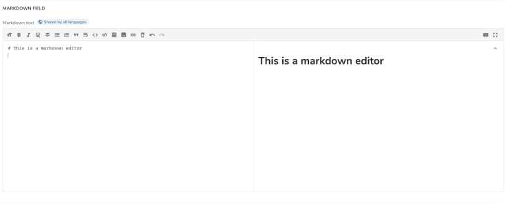
When a user creates content of Markdown field type in Jahia, Content Editor displays and the Markdown text field is editable with the Markdown editor that you added.

