Enhancing content types for editors
In this topic, you will learn more about content types definitions. As a Jahia developer, you'll be able to use several options in the content properties that you define to improve the experience of end users in Content Editor:
- Defining a helper for your property
- Setting custom validations and related custom messages
- Adding constraints for dates
- Setting a property as mandatory
- Adding a default value for your property
- Initializing choicelists (dropdown fields) with the right values
- Specifying manual or automatic ordering for subcontent in a content list
- To learn more about customizing the Content Editor form, please visit the relevant documentation.
Before diving into these options, you'll need to understand the selectors that are available for your properties.
Selectors
Depending on the property type, a corresponding input field is provided. You can override the default input field by adding a specifier after the type definition.
Usage/syntax
- field-name (type)
- field-name (type, selector)
- field-name (type, selector[options])
- type: define the type of data stored in the property. (list of types)
- selector: define the component used by the contributor to fill the property (list of selectors)
- options: are relative to the selector; you can chain them using a comma as a separator. e.g.:
[option1, option2]
Default selectors for data types
- for
string,path,uri: displays an input text field on a single line - for
long,double, anddecimal: displays an input text that can only accept numbers - for
boolean: displays a checkbox - for
date: displays a date picker - for
weakreference: displays an item selector
Custom selectors
Input Text
A simple text field for entering short information such as titles, names, or brief text values.

- Use when the input is short and precise (e.g., name, title, identifier)
- Avoid if formatting is needed (use RichText instead)
- If the input must come from a predefined list, use a Dropdown or Radios.
- Open entry content is defined by the contributor
- Only one entry is allowed
// definitions.cnd

[myNamespace:exampleType] > jnt:content, jmix:editorialContent
    - text (string)
Textarea
A multi-line text field for entering longer descriptions, comments, or paragraphs.
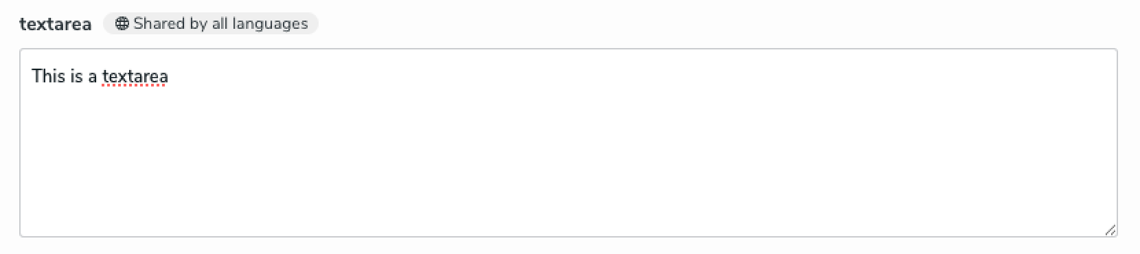
- Use when longer text input is needed, without formatting (e.g., comments, descriptions)
- If formatting is required, use RichText
- Open entry content is defined by the contributor
- Only one entry is allowed
// definitions.cnd

[myNamespace:exampleType] > jnt:content, jmix:editorialContent
    - textarea (string, textarea)
RichText
A text editor to format text (bold, italics, links, etc.) with CK Editor.

- Use when rich formatting is needed (e.g., articles, styled descriptions)
- If simple text input is enough, prefer a Textarea
- Open entry content is defined by the contributor
- Only one entry is allowed
// definitions.cnd

[example:field] > jnt:content, jmix:editorialContent
    - richtext (string, richtext)
Input Color
A graphical selector to pick a color using a palette or a hex input field.

- Use when users need to select a color freely
- If only a few color choices are available, prefer a Dropdown
- Open entry content is defined by the contributor
- Only one entry is allowed
// definitions.cnd

[myNamespace:exampleType] > jnt:content, jmix:editorialContent
    - color (string, color)
Dropdown
A dropdown list to select one or multiple options from a predefined set.

- Use when there are fixed and limited choices (3 to 10 options)
- If there are more than 10 options, add a search bar or consider a Double List
- If there are fewer than 3 options, prefer Radios
- Selection-based contributors cannot enter custom values
- Can manage flat list or tree
- Allows multiple entries
- The choiceLists initializers defined by default are:
resourceBundle,country,templates,templatesNode,users,nodetypes,subnodetypes,nodes,menus,script,flag,sortableFieldnames,moduleImage,linkerProps,workflow,workflowTypes, sort andcomponentTypes. Note that choicelist does not support decimal values. More about choicelists
// definitions.cnd

[myNamespace:exampleType] > jnt:content, jmix:editorialContent
    - dropdown (string, choicelist[resourceBundle]) = 'choice1' < 'choice1', 'choice2', 'choice3'
    - firstField (string, choicelist[sortableFieldnames]) < 'true', 'false'
    - play (string, choicelist[resourceBundle]) < 'true', 'false'
    - templateForLink (string, choicelist[templates,resourceBundle])
    - nodeType (string, choicelist[subnodetypes = 'jnt:page,jnt:contentList,jnt:folder',resourceBundle])
Double List
A selector to move items between two lists (selected and unselected). This selector is available with Content Editor 4.2.

- Use when users need to select multiple items from a very long list
- If the list is short, prefer a Dropdown with multi-selection
- Selection-based contributors cannot enter custom values
- Allows multiple entries
- Defined with json override
// definitions.cnd

[myNamespace:exampleType] > jnt:content, jmix:editorialContent
    - doubleList (string, choicelist[resourceBundle]) = 'choice1' < 'choice1', 'choice2', 'choice3'
// JAVA project: src/main/resources/META-INF/jahia-content-editor-forms/fieldsets/myNamespace_exampleType.json
// Javascript project: settings/content-editor-forms/fieldsets/myNamespace_exampleType.json

{
  "name": "myNamespace:exampleType",
  "fields": [
    {
      "name": "doubleList",
      "selectorType": "MultipleLeftRightSelector"
    }
  ]
}
Checkbox
Displays a checkbox that allows users to toggle a property on or off (true/false).

- Use for binary settings or yes/no choices (e.g., "Is featured," "Has banner," "Show title")
- Avoid using for multiple related choices use Checkboxes or Dropdown in that case
- Selection-based contributors cannot enter custom values
- Only one entry is allowed
// definitions.cnd

[myNamespace:exampleType] > jnt:content, jmix:editorialContent
    - checkboxes (boolean)
Checkboxes
Displays checkboxes that allow users to select one or multiple values.

- Use when there are a few and limited choices (2 to 4 options)
- If there are more than 4 options, consider a Dropdown
- If only one option can be picked, prefer Radios
- Selection-based contributors cannot enter custom values
- Allows multiple entries
// definitions.cnd

[myNamespace:exampleType] > jnt:content, jmix:editorialContent
    - checkboxes (string, choicelist) = 'choice1' < 'choice1', 'choice2', 'choice3'
// JAVA project: src/main/resources/META-INF/jahia-content-editor-forms/fieldsets/myNamespace_exampleType.json
// Javascript Project: settings/content-editor-forms/fieldsets

{
  "name": "myNamespace:exampleType",
  "fields": [
    {
      "name": "radios",
      "selectorType": "RadioChoiceList"
    }
  ]
}
Radios
A group of options allows the user to select only one value among several choices.

- Use when the user needs to select one option from a small number of choices (2 to 4)
- If there are more than 5 options, consider using a Dropdown to save space
- Selection-based contributors cannot enter custom values
- Only one entry is allowed
// definitions.cnd

[myNamespace:exampleType] > jnt:content, jmix:editorialContent
   - radios (string, choicelist[resourceBundle]) = 'choice1' < 'choice1', 'choice2', 'choice3'
// JAVA project: src/main/resources/META-INF/jahia-content-editor-forms/fieldsets/myNamespace_exampleType.json
// Javascript project: settings/content-editor-forms/fieldsets/myNamespace_exampleType.json

{
  "name": "myNamespace:exampleType",
  "fields": [
    {
      "name": "radios",
      "selectorType": "RadioChoiceList"
    }
  ]
}
Tag
A free-text field with auto-suggestion for existing entries.

- Use when users need to categorize content using keywords or tags
- If choices are predefined and fixed, prefer a Dropdown with multi-selection
- Open entry (with suggestion): content is defined by the contributor
- Can manage multiple entries (multiple keyword is required)
// definitions.cnd

[myNamespace:exampleType] > jnt:content, jmix:editorialContent
    - tag (string, tag) multiple
Number
A field for entering numerical values.

- Use when numeric input is required
- If the number should be chosen from predefined values, use a Dropdown or Radios
- For decimal a value, use
doubletype - The value can be negative
- Open entry: content is defined by the contributor
- Only one entry is allowed
// definitions.cnd

[myNamespace:exampleType] > jnt:content, jmix:editorialContent
    - number (long)
    - decimalNumber (double)
Date
A single line field and a calendar for selecting a specific date.
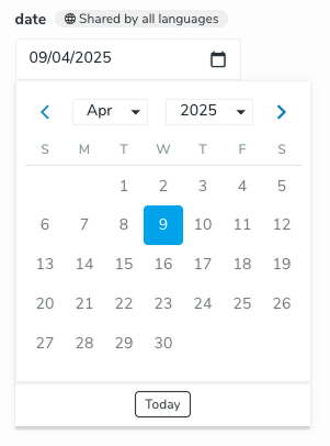
- Use when an event or action requires an exact date
- Open entry in a calendar: content is defined by the contributor
- Only one entry is allowed
// definitions.cnd

[myNamespace:exampleType] > jnt:content, jmix:editorialContent
    - date (date, datepicker)
DateTime
A single line field and a calendar for selecting a specific date and a time.
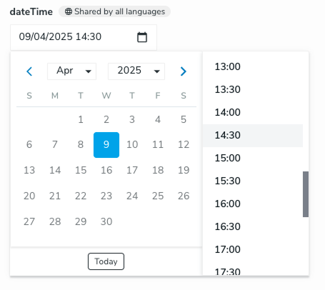
- Use when an event or action requires an exact date and time
- Open entry in a calendar: content is defined by the contributor
- Only one entry is allowed
// definitions.cnd

[myNamespace:exampleType] > jnt:content, jmix:editorialContent
    - datetime (date, datetimepicker)
Picker
A selector that allows the user to choose an item from already available content in the platform, with the option to add new items.

- Ideal for establishing relationships between content
- Reused previously defined content
// definitions.cnd

[myNamespace:exampleType] > jnt:content, jmix:editorialContent
    - filepicker (weakreference, picker [ type = 'file' ])
    - imagepicker (weakreference, picker [ type = 'image' ])
    - folderpicker (weakreference, picker [ type = 'folder' ])
    - contentfolderpicker (weakreference, picker [ type = 'contentfolder' ])
    - portletpicker (weakreference, picker [ type = 'portlet' ])
    - editorialpicker (weakreference, picker [ type = 'editorial' ])
    - editoriallinkpicker (weakreference, picker [ type = 'editoriallink' ])
    - categorypicker (weakreference, picker [ type = 'category' ])
    - pagepicker (weakreference, picker [ type = 'page' ])
    - sitepicker (weakreference, picker [ type = 'site' ])
    - userpicker (weakreference, picker [ type = 'user' ])
    - usergrouppicker (weakreference, picker [ type = 'usergroup' ])
Available pickers
The following pickers are available:
| Picker name | Description | Selectable types* |
|---|---|---|
| Default picker (default) |
The default picker is used to browse pages, content folders and files. As most of the content types can be selected, it is best to define content type restrictions not to provide an overwhelming experience to the editors. Available with Content Editor 4.1.0 |
|
| Editorial picker (editorial) |
This is the picker to use when referencing editorial content (e.g. a news or a rich text). Pages and content folders can be browsed. |
|
| Droppable content picker (droppableContent) |
This is the picker to use when referencing droppable content. Pages and content folders can be browsed. |
|
| File picker (file) |
Picker used to browse the media folders to select files. |
|
| Image picker (image) |
Picker used to browse the media folders to select images. |
|
| Video picker (video) | Picker used to browse the media folders to select video files. Available with Content Editor 4.1.0 |
|
| PDF picker (pdf) | Picker used to browse the media folders to select pdf files. Available with Content Editor 4.1.0 |
|
| Page picker (page) |
Picker displaying the page tree to only allow the selection of pages, e.g. when building links. If you rely on jmix:mainResource to display some content in a full page view, then you need to use the Editorial link picker below. |
|
| Editorial link picker (editoriallink) |
This picker is pretty similar to the page picker, as its main purpose is to select pages or content displayable in a full page view (jmix:mainResource). As such content can be created under pages or in content folders, it’s possible to browse both the page tree and the content folders. |
|
| Media folder picker (folder) |
This picker is used to browse and select media folders (folders containing files) |
|
| Content folder picker (contentfolder) |
This picker is used to browse and select content folders (folders containing editorial content) |
|
| Category picker (category) |
This picker is used to browse and select categories. This is different from the category selector, used by default to assign categories to contents. |
|
| User picker (user) |
This picker is used to search and select users |
|
| User group picker (usergroup) |
This picker is used to search and select user groups |
|
| Site picker (site) |
This picker is used to search and select sites. Note that if you need to select a site, we advise to use the following statement in the definition in order to display a more convenient drop down listing the sites instead of displaying a picker in a modal:
|
|
* if type restrictions are set for the property in the definition file, then these types take precedence over the selectable types provided by the picker, so the user can only select types allowed by the definition. See Setting content type restrictions
If none of these pickers meet your needs, you can override them for a given content property or define your own picker. Find out more in the Customizing Content Editor pickers page.
Helpers
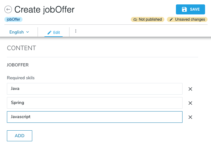
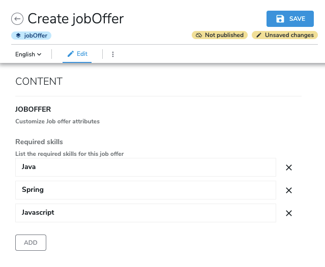
You may want to add description or helper text to either your content fieldset or a given field, to give some additional information to the user, for example here is a Job offer content, that contains a "skills" property. We expect the contributor to fill this multiple field with the required skills for the job.
The definition looks like this:
[qant:jobOffer] > jnt:content, qamix:qaContent, jmix:editorialContent
 - skills (string, text) i18n multiple
And the generated form looks like this:
It's possible to add a custom internationalized helper for the skills field using a resource bundle:
qant_jobOffer.skills = Required skills
qant_jobOffer.skills.ui.tooltip = List the required skills for this job offer
Since 8.0.3, it's also possible to add a custom internationalized helper for the jobOffer fieldset using a resource bundle:
qant_jobOffer_description = Customize job offer attributes
This displays the tooltip message for this field:
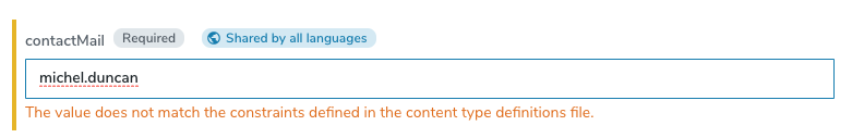
Regular expressions validation and custom error messages
If you need to control and validate that a text field for a given property has a specific format you can use regexp constraint.
[qant:jobOffer] > jnt:content, qamix:qaContent, jmix:editorialContent
 - skills (string, text) i18n multiple
 - contactMail (string, text) mandatory < '^$|[A-Za-z0-9._%+-]+@(?:[A-Za-z0-9-]+\\.)+[A-Za-z]{2,}'
In the previous definition we created the new property "contactMail" with a regexp constraint.
By default the form will show this error message in case the text field is invalid:
But you can customize this message using the resource bundle:
qant_jobOffer.contactMail = Contact mail
qant_jobOffer.contactMail.constraint.error.message = Please provide a valid email
This will display your internationalized message as a warning:
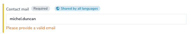
And the warning message will automatically disappear as soon as the text field value will match the regexp.
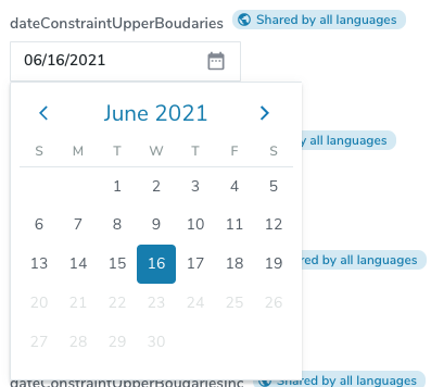
Date property constraints
It's possible to bound the date value using date boundary constraints in your definitions.
Samples are better than explainations, you can see in this definition all type of date boundary constraints:
[qant:dateConstraint] > jnt:content, qamix:qaContent, jmix:editorialContent
   - dateConstraintLowerBoudaries (date, DatePicker) < "(2019-06-04T00:00:00.000,)"
   - dateConstraintUpperBoudaries (date, DatePicker) < "(,2021-06-20T00:00:00.000)"
   - dateConstraintBothBoudaries (date, DatePicker) < "(2019-06-04T00:00:00.000,2021-06-20T00:00:00.000)"
   - dateConstraintLowerBoudariesInc (date, DatePicker) < '[2019-06-04T00:00:00.000,]'
   - dateConstraintUpperBoudariesInc (date, DatePicker) < '[,2021-06-20T00:00:00.000]'
   - dateConstraintBothBoudariesInc (date, DatePicker) < '[2019-06-04T00:00:00.000,2021-06-20T00:00:00.000]'
   - datetimeConstraintLowerBoudaries (date, DateTimePicker) < '(2019-06-04T05:00:00.000,)'
   - datetimeConstraintUpperBoudaries (date, DateTimePicker) < '(,2021-06-20T05:10:00.000)'
   - datetimeConstraintBothBoudaries (date, DateTimePicker) < '(2019-06-04T05:10:00.000,2021-06-20T05:10:00.000)'
   - datetimeConstraintLowerBoudariesInc (date, DateTimePicker) < '[2019-06-04T05:00:00.000,]'
   - datetimeConstraintUpperBoudariesInc (date, DateTimePicker) < '[,2021-06-20T05:10:00.000]'
   - datetimeConstraintBothBoudariesInc (date, DateTimePicker) < '[2019-06-04T05:10:00.000,2021-06-20T05:10:00.000]'
- You can delimit your date value using a
minimal boundary(always the first one) ormaximal boundary(always the second one) orboth - The boundaries always need to be separated by a
comma, even if you only use one of them. - You can specify if the boundary is included using
[brackets]or if the boundary is excluded by using(parentheses) - You can use these constraints on both
DatePickerandDateTimePicker
If you decide to use these boundaries, the date picker will only allow the user to select a valid date:
If the user enters a not allowed date, then a validation warning will be displayed automatically:

Mandatory properties
It's possible to set some properties mandatory, sometimes it makes sense to force your contributor to fill mandatory properties.
To do this you can add the keyword "mandatory" in your definition.
[qant:allFieldsRequired] > jnt:content, qamix:qaContent, jmix:editorialContent
   - sharedSmallText (string) mandatory
   - smallText (string) i18n mandatory
   - sharedTextarea (string, textarea) mandatory
   - textarea (string, textarea) i18n mandatory
   - sharedChoicelist (string, choicelist[resourceBundle]) = 'choice1' mandatory < 'choice1', 'choice2', 'choice3'
   - choicelist (string, choicelist[resourceBundle]) = 'choice1' i18n mandatory < 'choice1', 'choice2', 'choice3'
   - sharedLong (long) mandatory
Every kind of property can be mandatory, even multiple value properties. They will be displayed like this in the editor:
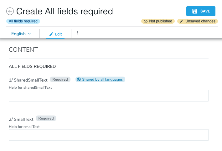
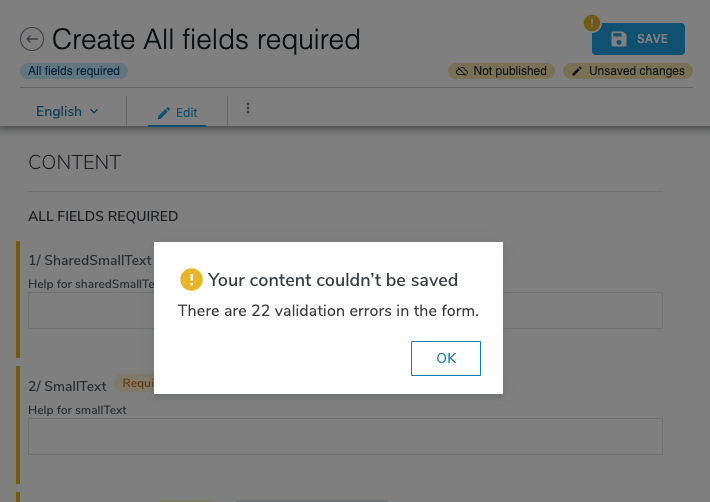
And the contributor will not be able to save until he provide a value for this mandatory properties:
Default values
It's possible to provide default values for your properties, if you do so it will prefill the editor with your configured default values.
Almost every type of property can have default values, even multiple values, the only exceptions are reference properties.
Note: Default values will only be used to prefill the editor when you are creating new content, but not when you are editing existing content.
Default values for single value properties
[qant:AllFieldsDefault] > jnt:content, qamix:qaContent, jmix:editorialContent, jmix:defaultPropMixin
    - sharedSmallText (string) = 'value 1'
    - sharedTextarea (string, textarea) = 'value 1'
    - sharedChoicelist (string, choicelist[resourceBundle]) = 'choice1' < 'choice1', 'choice2', 'choice3'
    - sharedLong (long) = 1
    - sharedDouble (double) = 1.1
    - sharedBoolean (boolean) = true
    - sharedBigtext (string, richtext) = 'value 1'
    - sharedDate (date) = '2019-06-04T00:00:00.000'
    - sharedDecimal (decimal) = 1234567890.123456789
Will display:

Default values for multiple value properties
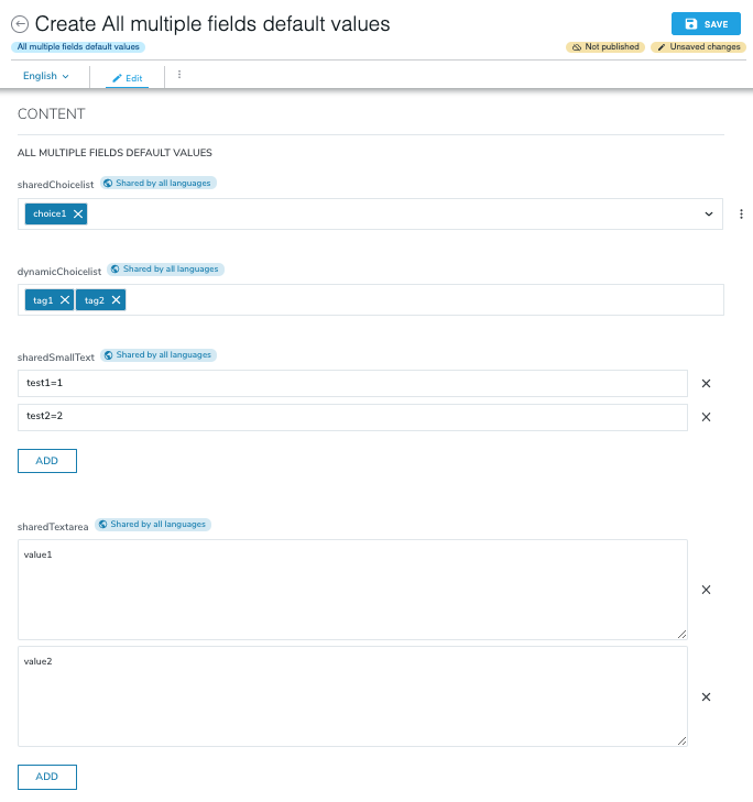
[qant:allFieldsMultipleDefault] > jnt:content, qamix:qaContent, jmix:editorialContent
   - sharedChoicelist (string, choicelist[resourceBundle]) = 'choice1' multiple < 'choice1', 'choice2', 'choice3'
   - dynamicChoicelist (string, tag[autocomplete=10,separator=',']) = 'tag1', 'tag2' facetable nofulltext multiple
   - sharedSmallText (string) = 'test1=1', 'test2=2' multiple < '[a-zA-z1-9]*=[a-zA-z1-9]*'
   - sharedTextarea (string, textarea) = 'value1', 'value2' multiple
   - sharedLong (long) = 1, 2 multiple
   - sharedDouble (double) = 1.1, 2.2 multiple
   - sharedBoolean (boolean) = true, false multiple
   - sharedBigtext (string, richtext) = 'value 1', 'value 2' multiple
   - sharedDate (date) = '2019-06-04T00:00:00.000', '2029-06-04T00:00:00.000' multiple
   - sharedDecimal (decimal) = 1234567890.123456789, 1134567890.113456789 multiple
Will display:
Restricting content type creation with permissions and roles
You can use permissions and roles to restrict the content types that your users can create. Inside the Jahia Administration in the role administration page, you can select or unselect the node types sections you want to allow for a given role.
These permissions are available on "Current site" and "Templates and Components":
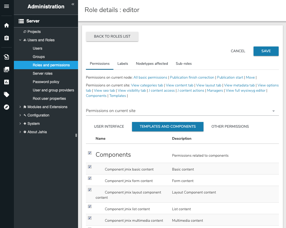
Every permission listed here corresponds to a mixin and section used to display the content type in the content type tree selector.
for example:
[qant:jobOffer] > jnt:content, jmix:basicContent, jmix:editorialContent
 - skills (string, text) i18n multiple
 - contactMail (string, text) mandatory < '^$|[A-Za-z0-9._%+-]+@(?:[A-Za-z0-9-]+\\.)+[A-Za-z]{2,}'
Is displayed under basic content section, because of the mixin inheritance on "jmix:basicContent":

If you disable the permission "Component jmix basic content" for role "editor",
any user using the role "editor" on the current site will not be able to create any content of the "jmix:basicContent" section, including our jobOffer content type.
Choicelists
It's possible to provide a data set for a choicelist in multiple ways.
You can provide the available values directly in the definition:
[qant:choicelist] > jnt:content, qamix:qaContent, jmix:editorialContent
 - resourceBundle (string, choicelist[resourceBundle]) = 'choice1' < 'choice1', 'choice2', 'choice3'
Then you can provide a translation for each value using the resourceBundle option, and provide the internationalized name using resource bundle files:
qant_choicelist.resourceBundle = Resource bundle
qant_choicelist.resourceBundle.choice1 = Choice one
qant_choicelist.resourceBundle.choice2 = Choice two
qant_choicelist.resourceBundle.choice3 = Choice three
This will display:

Alternative selector for multiple selection in a choicelist
Available with Content Editor 4.2
The default drop down for choicelists supports multiple selection. However, when the list is too long or when one needs to manage the order of the selected items, it is advised to use the alternative MultipleLeftRightSelector
A json override is needed to use this selector.

Choicelist initializers
You can use choicelist initalizers to provide dynamic data sets, Jahia provides some of them ready to be reused.
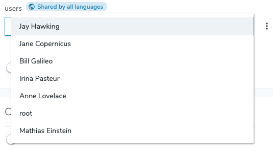
The user choicelist
[qant:choicelist] > jnt:content, qamix:qaContent, jmix:editorialContent
 - users (string, choicelist[users])
Will display the list of users available on the server:
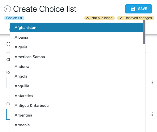
The country choicelist
[qant:choicelist] > jnt:content, qamix:qaContent, jmix:editorialContent
 - country (string, choicelist[country])
Will display a list of countries:
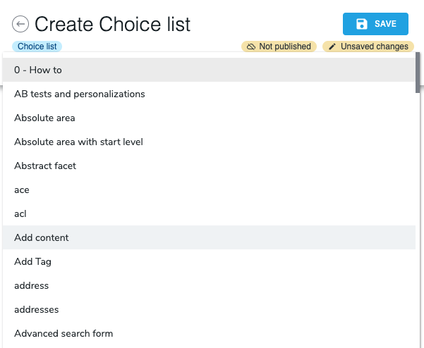
The node type choicelist
[qant:choicelist] > jnt:content, qamix:qaContent, jmix:editorialContent
    - j:nodeTypes (string,choicelist[nodetypes=nt:base])
Will display a list of all available nodetypes that inherit from the nodetypes option:
The node choicelist
[qant:choicelist] > jnt:content, qamix:qaContent, jmix:editorialContent
 - category (weakreference, choicelist[nodes='/sites/systemsite/categories/;jnt:category'])
This one is a little bit complex, but very useful, you can provide a path and a node type and it will list the available nodes that correspond, you will be able to store the result in a weakreference directly.
In the current example, it's a way to list some categories and store the chosen one in a property named "category":

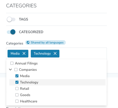
Note: this can be useful, because you can setup the contents you want to display in the list, by choosing the path and the node type.
In case you want to categorize your content, you just have to enable the fieldset already available in the editor:
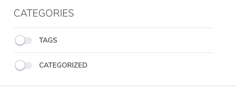
Then select the categories you want to add to your content.
More About choicelists
Choicelist initializers can be extended, and you can create your own ones, if you want to know more about choicelist initializers, please read:
Choicelist initializers documentation
Setting manual and automatic ordering of subcontent
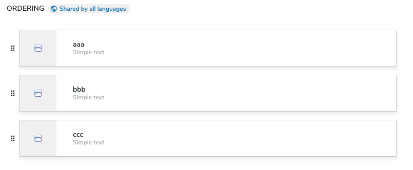
In certain cases, editors can order the subcontent (children) in a content list. Content Editor provides two options for ordering:
- Manual ordering
Allows editors to manually drag-and-drop subcontent and reorder them as they like.

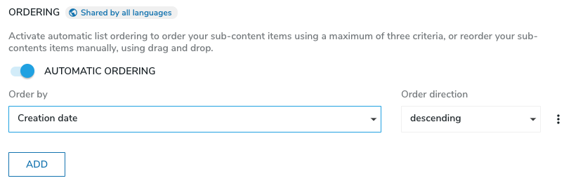
- Automatic ordering
Allows editors to automatically order subcontent by selecting one or more shared child properties and specifying the sort direction.
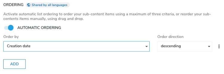
There are multiple ways to specify how ordering occurs, which are located in your content definitions.
jnt:contentList and jnt:area.Sometimes you may want your content list to be only manually orderable or only automatically orderable, or you may want both options and let the editor choose.
To specify how your content list is ordered:
- To make your content list only manually orderable, specify the
orderablekeyword on your content list definition, like this:[qant:simpleListManuallyOrderable] > jnt:content, jmix:list orderable + * (jnt:text)
Your editors will only be able to manually order the text subcontent of this list and will not be able to automatically order them. - To make your content list only automatically orderable, add the
jmix:automaticallyOrderablemixin to your content list, like this:[qant:simpleListAutomaticallyOrderable] > jnt:content, jmix:list, jmix:automaticallyOrderable + * (jnt:text)
- To have both options and let the editor choose, combine the
orderablekeyword andjmix:automaticallyOrderablemixin, like this:[qant:simpleListHybridOrderable] > jnt:content, jmix:list, jmix:automaticallyOrderable orderable + * (jnt:text)
Automatic ordering details
Jahia applies automatic ordering to subcontent during the rendering of a list when a user loads a page. Ordering is done by the list.hidden.header.jsp JSP view of jmix:list. Note that subcontent is not reordered in the JCR storage and is only ordered when the page displays. This means that automatic ordering is not applied if content is consumed through our GraphQL API. To ensure that the content is always ordered when using Jahia in headless, you must use sorting capabilities of our API and queries.
To make the automatic ordering work, you have to inherit from jmix:list and ensure the view is used to load and display the subcontent. For developers, here is the source: list.hidden.header.jsp.
Manual ordering details
Not all the node types are visible in the manual ordering section. By default, Jahia displays the subcontents of jnt:content types only.
Most of the time, your content inherits from jnt:content. If your content does not inherit from jnt:content and you want to display your child nodes in the manual ordering section, you can set the jmix:manuallyOrderable mixin on the child node type definition. This way it will appear in the manual ordering section.
The following example shows a definition for this use case.
[qant:simpleListManuallyOrderable] > jnt:content, jmix:list orderable
 + * (qant:simpleChild)

[qant:simpleChild] > jmix:manuallyOrderable
 + childProp (string)
jmix:manuallyOrderable mixin is only meant to be used on child node types and not on the list itself.Compatibility between Jahia 7 and Jahia 8
Examples for the children ordering section in Content Editor show Jahia 8 because some mixins have been introduced in Jahia 8 to simplify how you handle children ordering.
We have tried at the same time to keep the compatibility with the same kind of features that were already available in Jahia 7. If you come from Jahia 7 or another previous version, feel free to continue to use the mixins you already know that provide similar features. Here is a summary table of all available mixins (old and new) and options for the child ordering feature:
| Name of the mixin | Level | v7/v8 | description |
|---|---|---|---|
| orderable (not really a mixin) |
List | Different | In v7, used to display the List Ordering tab that contained both the manual and automatic list ordering features. In v8, used to display the UI to manually order subcontent. |
| jmix:list | List | Same | Used to identify content that can be displayed as a list. Used by the views of list ( hidden.load.jsp and hidden.header.jsp) to style the list and load contents. |
| jmix:automaticallyOrderableList | List | New |
In v8, displays the UI for automatic list ordering (allowing you to add |
| jmix:renderableList | List | Same | Used to set a view for the subcontent of the list (to avoid defining it on each subcontent item). |
| jmix:manuallyOrderable | Subcontent | Same |
Subcontents of |
| jmix:orderedList | List | Same | Used to add the properties to store the automatic list ordering criteria when a user selects Automatic list ordering in the UI. This mixin is used internally by Jahia and you should not add it to your content definition. |
| jmix:listOrdered | List | Same | Mixin associated with the ordered/unordered view that is added on lists and areas. If you use this mixin, note that it may become deprecated in a future release. |