Jahia UI Under the hood
Technical overview
A UI tech stack combines technologies and tools to build a software application's user interface (UI). It typically includes a combination of front-end development frameworks and libraries and design, prototyping, and testing tools.
It's important to note that the UI tech stack is a subset of the overall technology stack of the application, which can include backends, database, and other technologies.
Jahia’s Tech stack is composed of the following elements:
- The design system, called Moonstone provides common UI elements that can be reused in multiple places in the UI, as well as in multiple modules
- React, aka ReactJS, is the Javascript framework that is used to build UI components
- GraphQL, is the communication layer between the client and server applications. Jahia’s functionality is available through the GraphQL API, making it easy for developers to offer similar functionality to the built-in ones when building their solutions.
- OSGi, on the backend, makes it possible to develop modular applications that can even be updated at runtime
- JCR, jCustomer, and ElasticSearch backend services: make it possible to access and store data in different ways and access it through standard APIs.

GWT is being phased out
Historically, Jahia’s UI was built using the GWT toolkit, but it is now being phased out, and all the new UIs are now built using the tech stack presented above. The objective is to replace all the remaining GWT screens throughout Jahia’s roadmap to standardize on the new stack. One of the most significant advantages of this approach is the decoupling of the UI and the API since all the UI components will always be using the GraphQL API as a means of communication instead of the much more obscure GWT-RPC system.
What is a design system? (Jahia Moonstone)
A design system is a collection of design guidelines, components, and patterns used to create a consistent visual language across a product or organization. It defines the look, feel, and behavior of a product's user interface and provides a set of reusable components and patterns that can be used to build new user interfaces quickly and consistently. A design system typically includes typography, color palettes, iconography, spacing and layout guidelines, and UI components such as buttons, forms, and navigation elements. The goal of a design system is to create a consistent user experience across a product or organization and to make it easier for designers and developers to create new user interfaces. It helps to improve the design and development process, maintain consistency, and reduce development time.
Jahia’s UI design system is called: Moonstone and is composed of React components that provide all kinds of components that can be used for building powerful UIs. Components may range from simple buttons and input fields to navigation elements such as accordions or navigation menus to tree views. None of these components require any kind of backend; they are all using properties that are passed to the components upon initialization.
You can find more information about the various components and their usage in the Moonstone Storybook.

Basic design system layout components
In this section, we illustrate a few essential Moonstone layout components that are important to get familiar with, as extension designers will need to understand what they are and how they may be used.
Primary navigation

The primary navigation component is usually collapsed into a single column of icons but can be expanded to give more information about what the icons represent. You can think of each element of the primary navigation of an application or a module.
Secondary navigation

A secondary navigation component is used once a primary navigation component item has been selected. It allows for deeper navigation within an application or module.
Layout Module

The layout module contains the secondary navigation and the module or application content. It is how most of the existing UI is rendered.
Important Note
Moonstone is still under active development and is not fully stable nor officially supported. However, as we do use it in Jahia’s UI, semantic versioning is respected to avoid breaking existing versions.
UI Extension Use cases
This section will illustrate the possibilities for adding new UI components in Jahia. We will start by looking at some examples.
Adding a new panel in jContent
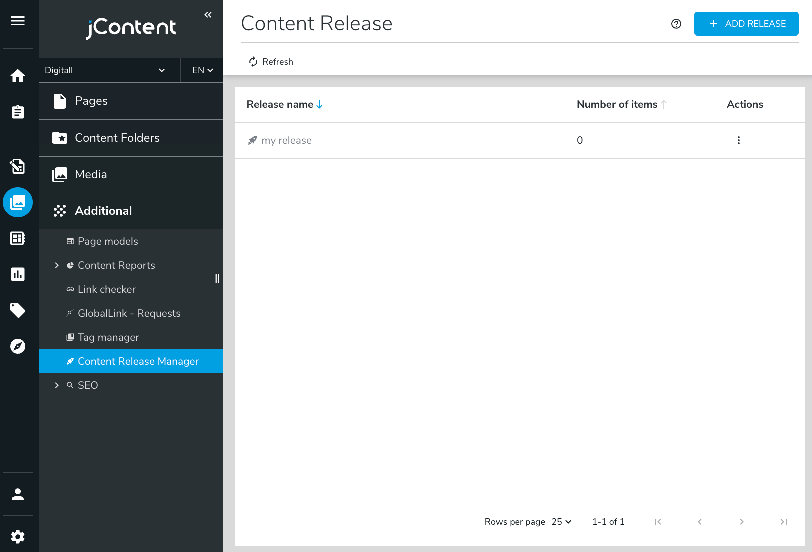
In the above example, a new panel has been added to jContent’s navigation menu: Content Release Manager. Associated with this new entry is a new application that is displayed on the right side of the screen. Applications may be integrated in this way to offer a seamless experience between Jahia’s built-in features and extensions provided by developers. More information on achieving this can be found in Extending jContent UI documentation.
Adding a new panel in Content Editor

This example illustrates the possibility of adding a new panel in the Content Editor to display a custom UI for the edited content object. In this example, we show the integration of an Elastic Kibana dashboard integrated into the page content editor screen. More information on achieving this is available in the Extending the Content Editor UI documentation.
Adding new actions to Content Editor fields

This example illustrates the possibility of adding new actions to a “three-dot” menu on a content field. In this case, it shows how a module can add a “Copy to other languages” feature on a content field. Once the action is selected, a popup component is displayed to select the target languages for the copy. This example also shows the power of such custom components as they may add more complex UI elements than simple navigation elements. More information on achieving this is available in the Extending the Content Editor UI documentation.