Understanding Jahia modules
Before you create a module, you should become familiar with the default module, the directory structure of modules, and module configuration options.
Components are an important part of modules. A component is a content archetype that editors use to create content. BoundComponents are also discussed here. BoundComponents bind one component to another component.
About the default module
The default module contains common content definitions, rendering templates, resource bundles, and static assets. The module is deployed by default and is used as the basis for many modules.
The module includes a set of features and components, providing base Jahia template functionality:
- Hide templates
Allows removing a particular template from the drop-down list of available templates - Navigation menu
Supports building navigation menus manually and in automatic mode - Lists
Supports managing lists in Jahia - Tagging
Uses the social tagging feature in Jahia - User Profile
Provides instructions on how to develop inline editable pages as available in user profile pages
Module directory structure
Maven2 directories
Jahia Modules uses the Maven 2 directory structure (see Maven Standard Directory Layout).
src
| + main
| + java
| + resources
| + webapps
| + site
Jahia module directory
The Jahia directory is structured like this:
webapps
| + javascript - contains all javascripts for the module
| + css - contains all css for the module
| + resources - contains all resources for the module
| + icons - contains all icons for the module content definitions
| + OSGI-INF - contains OSGi descriptors (for example, OSGi Blueprint)
| + META-INF
     | + spring - Spring XML files
| - definitions.cnd - definitions for the module
| - rules.drl - module rules
| - import.xml - content imported when the module is loaded the first time
When you name your icons and resources, consider the following naming practices:
- icon names
- Use the name of the definition replacing
":"with"_" - Use png format example:
jnt:newsneeds ajnt_news.pngicon
- Use the name of the definition replacing
- resource names
- From the pom.xml file, get the module name (in name/ tag) and remove spaces. For example, for the role module, the name is Jahia Roles, its resource files will be named JahiaRoles.properties
Configuration options
Module configuration options
Depending on your needs, you might want to parameterize some aspects of you modules to customize it for your deployment environment. You have several options to do so as shown below.
OSGI Configurations
Sometimes you want to be able to deploy OSGI configuration files at when you deploy modules. You can do so by adding your configuration files into your module source folder under /src/main/resources/META-INF/configurations.
The following example is from the Elasticsearch - search provider module.

This automatically deploys the configuration files in the /digital-factory-data/karaf/etc folder. The OSGI framework automatically registers the configuration during runtime.
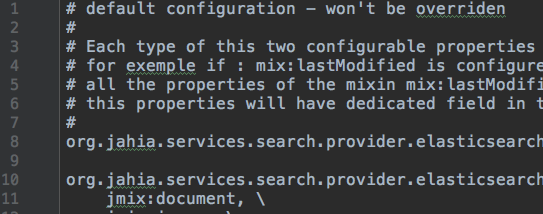
Note that a configuration file is overriden each time the module is deployed. This is useful if the configuration file needs to evolve in future versions of your module. If you want to avoid the override of the configuration file during module upgrade, you need to start the first line of your configuration file with the # default configuration marker.
The following example is from the Elasticsearch - search provider module.
Components
A component is a content archetype that editors use to create content. Components appear in the left panel selector and can be dragged to an area inside a page.
Declaring components
Components can be declared in a module through a node type definition. All components that are declared in a module are deployed to a tree in the JCR, under the /templateSet node. For every node type definition found, a jnt:component node is created. Components are organized in components folder of type jnt:componentFolder. An administrator can browse these nodes using Jahia Tools.
Components organization
Components are organized by inheriting from special mixin types. Any module can create a new component folder by creating a mixin type inheriting from jmix:droppableContent.
For each mixin type that inherits from jmix:droppableContent, like jmix:basicContent, a component folder is displayed. If a type inherits from a mixin derived from jmix:droppableContent, it will be stored in the corresponding component folder. Components that do not inherit from jmix:droppableContent are stored in a folder named nonDroppableComponents.
Modules deployment
Components, views, and options provided by a module are only available to a site once the module is deployed on it.
Studio-only components
Components can inherit from jmix:studioOnly. These components are intended to be used for template development only. They are available only in the Studio and are not deployed to sites.
Setting rights on components
You can use roles and permission to restrict access to different components by users or groups. If a user does not have access to a component, it does not appear in the UI in Jahia. However, they can still edit existing nodes based on these components.
By default, rights are inherited from the site. Users who have edit access can use all components. To restrict permissions, remove permissions from the site-privileged group, then add the users or groups who should be able to access the component.
To set rights on a components:
- Navigate to Administration>Server>Users and Roles>Roles and Permissions.
- Then, select a site role.
- Select the Templates and Components tab and permit and restrict access to individual components.

- Click Save.
BoundComponents
BoundComponents bind one component to another component. For example, you can bind a calendar component to news component and specify that the news list only displays links for days that have a news entry. This can be extended to allow your calendar to interact with any type of list of content. This section shows how:
- to define a bound component
- to refer to the bound element to control it
- a user can define the bind between two component
Defining a bound component
In your cnd file, your definition should inherit the <jmix:bindedComponent> mixin type. This mixin defines a simple weakreference as a property.
[jmix:bindedComponent] mixin
- j:bindedComponent (weakreference)
This example definition defines that the tagging element has to be bound.
[jnt:tagging] > jnt:content, mix:title, jmix:siteComponent, jmix:bindedComponent
This example definition extends the calendar component, which needs to be bound to another component. This definitions adds the startDateProperty and endDateProperty properties which use choicelist initializers to retrieve the list of available properties from the bound component. If you bind your calendar to a list of news, content editors can access to all the news properties that populate the list, and they must choose a date property to make your calendar work as intended.
[jnt:calendar] > jnt:content, jmix:editorialContent, jmix:bindedComponent
- startDateProperty (string,choicelist[linkerProps=j:bindedComponent])
- endDateProperty (string,choicelist[linkerProps=j:bindedComponent])
Referring to the bound element to control it
In your module, view files should access the j:bindedComponent property to retrieve the bound component.
<c:set var="boundComponent" value="${uiComponents:getBindedComponent(currentNode, renderContext, 'j:bindedComponent')}"/>
This example from the calendar module fills a map with the number of node per date.
<c:forEach items="${linked.node.nodes}" var="linkedChild" varStatus="status">
<fmt:formatDate pattern="yyyy-MM-dd" value="${linkedChild.properties[currentNode.properties.startDateProperty.string].date.time}" var="startDate"/>
<c:choose>
    <c:when test="${empty datas[startDate]}">
        <c:set target="${datas}" property="${startDate}" value="1"/>
    </c:when>
    <c:otherwise>
        <c:set target="${datas}" property="${startDate}" value="${datas[startDate]+1}"/>
    </c:otherwise>
</c:choose>
</c:forEach>
Enabling a user to define the bind between two component
To enable a user to define to which component your component will be bound to, you have to define a draggable element in your view file. This draggable element can be dropped by the user to the element that they want bound to your component. To define this element just use the <<template:linker>> tag.
Here is a simple example from calendar:
<template:linker path="*"/>
Here is a more advanced example of tagging that requires that you must have a specific mixin type on the bound component:
<template:linker path="*" mixinType="jmix:tagged"/>