Working in Edit mode
About Edit mode
Edit mode provides advanced functionality for editing content in a site. The site that you see originates from the workspace and is not the site as it appears online. You can browse the site just like you would do in its live version. Site pages contains areas and lists which contain content. For more information see How to contribute content.
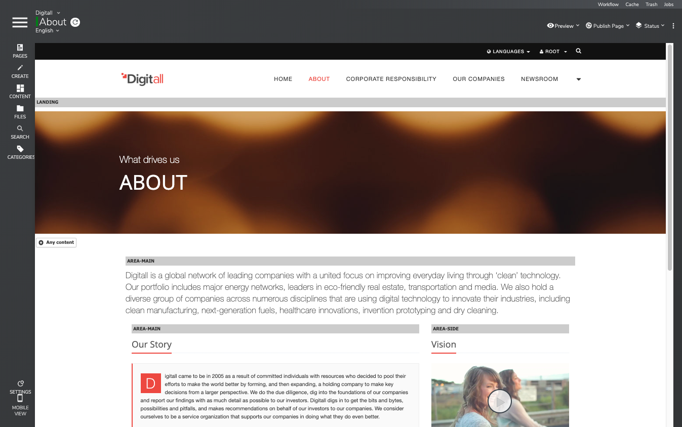
The main edit pane is bordered by 3 toolbars.
- The left toolbar contains the features to manage the site map, navigate to pages and to create and find content.
- The page/selection toolbar at the top left displays the current page or selected item with the corresponding edit menu, the preview menu, the language and site switchers, as well as the Jahia menu button.
- The application toolbar at the top right mainly provides status and publication tools.
Opening Edit mode
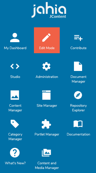
You can open Edit mode from the Jahia Menu.
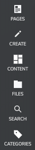
Using the left toolbar
You can use the left toolbar:
- Browse the pages of the site and update the site map
- List the types of contents that can be created on the site
- Browse out-of-context contents and add them to the current page
- Browse files and images and add them to the current page
- Search site contents
- List content associated with a category
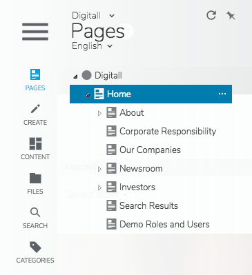
For example, you can click the Pages button to display the Pages tab in the left panel.
To keep the left panel open, click on the pin button  . The edit frame is re-centered and the pin button turns blue. Click again to unpin the left panel. The refresh button
  refreshes the left panel. By default, the left panel automatically refreshes when:
- A page is added in the tree
- A workflow is started or progressed
- A publication finishes
- The language is changed
By default, the tab displays over the page. The tab becomes hidden when you:
- Click again on the same left toolbar button
- Clicks anywhere in the page in the edit pane
- Drag-and-drop content
Your administrator can choose to disable the automatic refresh, for example, as it can be inconvenient when lots of publications happen at the same time). When disabled, the refresh icon turns blue to indicate that a manual refresh is needed.
About the Pages tab
The Pages tab displays the sitemap or page tree of your site. You can open a page by clicking on it to display the page in the edit area. You can also use the site switcher at the top of the tab to easily switch from one site to another.
You can manage your site tree by creating new pages, separators and links from this site tree. For more information, see Pages and navigation contents.
To edit a page, open the edit engine right click and select Edit or clicking on the three dots button ... which appears when hovering on the page in the tree. You can move or reorder pages either by drag-and-drop or cut and paste. When you paste a page you can:
- Select Paste to copy the page and its subpages. Contents is duplicated and is independent from and can be modified without impacting the source page.
- Select Paste one page to copy only the page, but not the subpages.
The first element displayed in the page tree is the site, which displays a circle icon. Site level permissions should be set from the edit engine of the site, which can be opened the same way as any page.
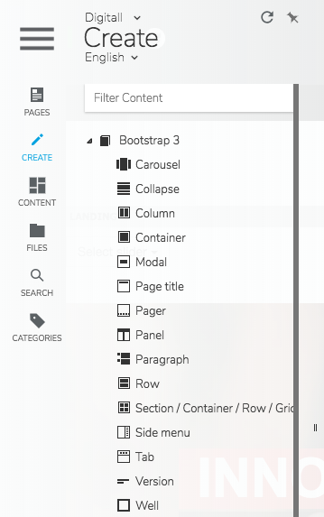
About the Create tab
You use the Create tab to access to the components (content types and features) available on your site when you create new contents in your pages. You can drag and drop components into the edit frame to create a new content.
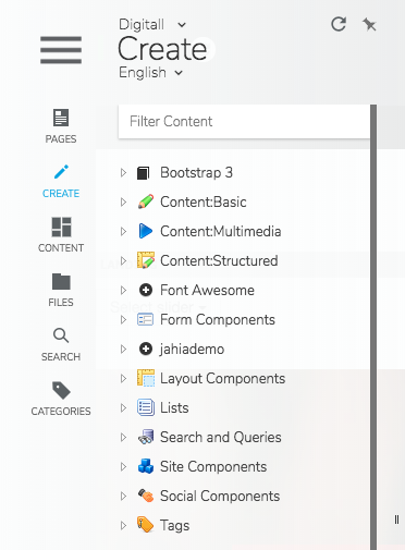
Components are organized into logical groups. Click the arrow beside a component group to display components that you can add to pages.
Use the field above the component list to filter components. If you know the name of the component you are looking for, you can filter the list to find it. The entry in the filter field does not need to be validated, as it operates in real time as text is entered.
More information on creating content is available in Adding editorial content to a page.
About the Content (out-of-context content) tab
Use the Content tab to browse the folders containing out-of-context contents. Such contents are found in the contents folder of every site, as well as in the personal folder of the user.
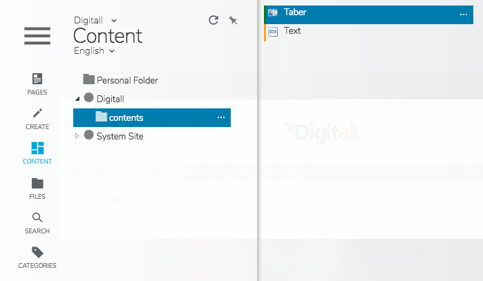
The elements inside a content folder display when the folder is selected. The color indicator next to every element corresponds to its publication status, for example, if the content has been published or modified.
You can drag and drop elements to a location in the current page to create a reference. You can also create new folders and upload files through the contextual menu of the folders.
Note that the contents folder of System Site is mainly used to share contents between sites. This case might not apply for you.
About the Files path
You use the File tab to browse folders containing files and images. The files are stored in the contents folder of every site, as well as in the personal folder of the user.
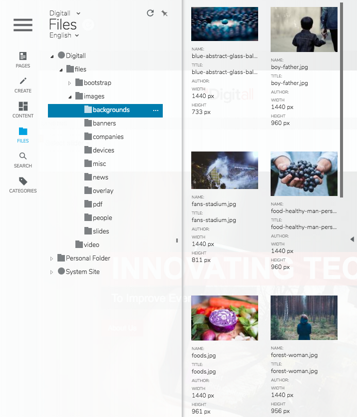
You can drag and drop elements to a location in the current page to create a reference. You can right click on a file or image and then choose to download the file or image or display an image preview. You can also create new folders and upload files through the contextual menu of the folders.
Note that the contents folder of System Site is mainly used to share contents between sites. This case might not apply for you.
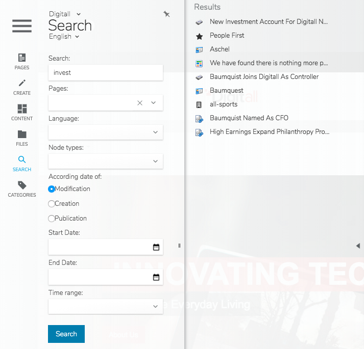
About the Search tab
You can use the Search tab to perform full-text searches of any type of content, including all binaries you can browse with the File manager. Several options are available to simplify search and make it faster:
- The standard operators AND, OR, NOT
- Quotes to search for a specific phrase ( "content manager")
- The wildcard character * is allowed (Flo* -> Florence, Flower, etc)
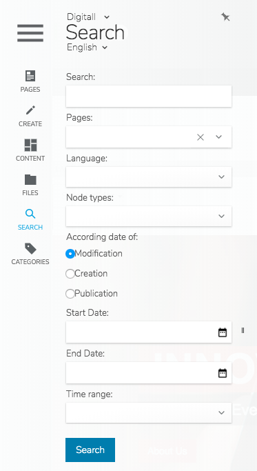
To speed up your searches, you can make them more specific and restrict them to:
- Part of the tree by specifying the departure point of the search (Page picker)
- A language by selecting from the available languages in a drop-down menu
- A specific editorial content type by selecting from the various types from a drop-down menu
You can also refine the search scope by choosing a date range (start date – end date) or a duration (in months). Those dates or duration will be compared to the chosen metadata: creation date, modification date or publication date.
Content items listed in the search results can be selected, and inserted into the current page with a simple drag and drop. The original content is neither moved, nor modified. This action simply creates a reference to the content.
When opening the contextual menu on a search result item, the option "Go to content" appears. This redirects to the page containing the content or the content itself, if it can be displayed on its own. The option "Go to content" is not available for out-of-context contents, i.e. contents created in the "contents" folder of the site. Note: in the "Usages" tab of out-of-context contents, you can find links to all the pages or other contents referencing them.
About the Categories tab
Categories are used to classify and enrich contents. Categories are organized in a tree, meaning that a category can have sub-categories. The “Categories” tab allows you to browse this category tree and to display the contents associated to the selected category:
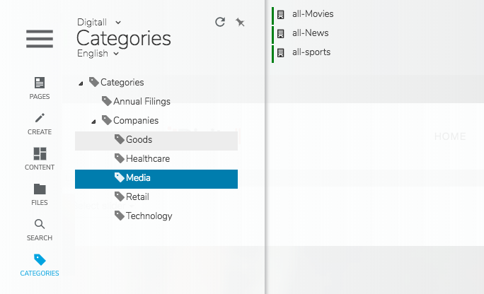
These elements can be dragged and dropped in the desired location of the current page in order to create a reference.
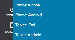
About Mobile View
Mobile view enables authors to display their site as it would appear on a mobile device. Four mobile device views are available:
- Phone: iPhone
- Phone:Android
- Tablet: iPad
- Tablet: Android
Editors can continue to work on the content exactly as if no channel selection is applied.
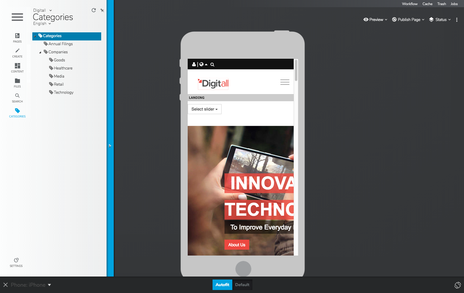
You can change the device orientation using the rotate button  .
.

The Autofit button adjusts the size of the device to your screen. It is particularly useful when selecting a tablet.
It is possible to define if a content should be displayed or not on selected mobile device types (“Channels”). This is done using the Channels tab in the edit engine of the content.
About the Site Settings tab
This Site Settings tab is visible only by users with special permissions who manage global site settings and access specific site features. For more information on site administration, see Managing site settings.
Using the page and selection toolbar
The page and selection toolbar displays the current site, name of the page, and page language.

When you select content on a page then the content name displays below the page name.

If you select several content items, then the number of selected items is displayed below the page name:

To clear the selection, click Clear Selection  or click anywhere on the page.
Jahia Menu button
This menu allows switching from one mode to another by accessing to the general menu. The items listed depend on the user rights.
Site selector
If you are an editor on several sites, you can use the site selector to switch from one site to another. The home page of the selected site then displays in the edit frame.
Language switcher
If a site is available in several languages, you can use the language switcher to display the current page in any available language for the site.
Preview menu
The preview button opens the page in its staging version in a new browser tab. More options are available when clicking on the preview drop-down button:
- Live
Shows the live version of the site. - Preview
Shows the staging version of the site. - Customized preview
Previews the site as it displays for a selected user (if specific live roles are set on content) at a given date (if visibility conditions are set on content). You can also choose to preview the site as it would look on a mobile device. - Compare staging to live version
Displays the workspace version of a page or selected content beside the online version and allows you to highlight differences. - Compare 2 published versions
Compares a page or selected content at two different dates. - Show published versions
Displays content at the date that you specify.
Please note that previous versions of contents might not be available as they can be deleted for server administration purposes.
Publication
The publication button opens the publication dashboard either for the current page or the currently selected item(s), in the current language. More options are available when clicking on the publication drop down button:
- Publish the page / selected item(s) in the current language
- Publish the page / selected item(s) in all the languages of the site
- Unpublish the page / selected item(s) in the current language
Finally
- Open the Publication Manager, a tool to manually select multiple items and launch a publication process
The documentation regarding publication is available here.
Status

Publication status
It is possible to see the publication status (published, never published, unpublished, modified) of all the contents of a page by checking the box "Show Publication status" in the “Status” menu. Information layers are then displayed on the page. To mask these layers, you can either click on one of them, or uncheck the box in the “Status” menu.

Permission status
The permission status shows a little icon over contents on which roles (live and edit) are different compared to the parent content:
Visibility status
The visibility status shows a little icon over contents subjected to visibility conditions. A red icon indicates that the content is currently not visible online (the visibility conditions are not met), a green one indicates that the content is currently visible online (the visibility conditions are met).
Show untranslated content
This option is only displayed for multilingual sites. It allows you to see in the page if content items have been created in other languages in the current page, and which miss a translation in the current language.
Option menu
This option menu corresponds to the contextual menu of the current page or the currently selected content(s). The options displayed depends on the selected content(s) and the roles of the user. The most common menu options are:
- Edit: open the edit engine of the content
- Delete
- Copy
- Translate: open the content translation interface, for sites available in several languages
- Export
- Import
- Lock
Application toolbar
Workflow
This menu allows to:
- Execute tasks at particular steps of an ongoing workflow in which the user is involved. The documentation regarding the workflow dashboard is available here.
- Start different workflows (depending on/if specific workflow processes are deployed on your platform)
The number of workflow tasks awaiting an action is displayed over the Workflow menu: 
Trash
This button gives access to the list of content items “marked for deletion” meaning that their deletion has been required by an author but is not definitively done. Contents can be undeleted from the trash, or, on the contrary, permanently deleted.
Cache
This menu is only available to certain administrators. It gives the possibility to manually flush caches in Live Mode.
- For the selected object in the Edit-Frame (or the page currently displayed if no item is selected)
- For the full site (this may have a deep impact on performances)
- For the whole platform (this may have a very deep impact on performances)
Jobs
This button is available for users allowed to open the background job management window. When a publication job is happening, the job button looks like: 