Extending jContent UI
Add a new accordion in jContent
You can add a new accordion in the secondary navigation of jContent by adding an accordionItem entry in the registry with the jContent target. You can create a new accordion from scratch by defining the render attribute, or inherit from a base accordion definition provided by jContent.
Content Tree accordion
Similarly to the content, pages, and media accordion, you can configure which nodes to display in the tree by extending the renderDefaultContentTrees item.
Here's the list of available properties that can be useful when you define an accordion that extends renderDefaultContentTrees in jContent:
icon
The icon that will be displayed next to the accordion namelabel
The name of the accordionrootPath
The root path where to start to display the nodestargets
Specify a priority to determine the order ([‘jcontent:<priority>’])canDisplayItem
A function that can be added to define if an item can be displayed under the accordion.requireModuleInstalledOnSite
Display the accordion only if a specified module is enabled for the site.requiredSitePermission
The site permission is required to access the accordion. If the connected user does not have the necessary permission, the accordion will not be displayed.
This property is mandatory.isEnabled
A custom function to specify the cases for which we want to display the accordion.- treeConfig
The object that contains the configuration of the items of the tree. In this object are defined the selectableTypes, the openableTypes, and the dnd (drag & drop) configuration.- selectableTypes The types of the nodes that can be selected in the tree
- openableTypes The types of the nodes that can be opened in the tree
- dnd The drag and drop object configuration
- tableConfig
The object that allows to configure the table of contents. It's in this configuration object that you define how to display the header of the table with the tableHeader property, the view mode with the viewSelector property and the drag and drop behaviour.
Extending existing accordions
It is recommended to extend default accordions (pages, content-folders, media, apps) and only override certain properties as needed.
// retrieve existing pages accordion
const baseAccordion = window.jahia.uiExtender.registry.get('accordionItem', 'pages');
window.jahia.uiExtender.registry.add(
  'accordionItem',
  'accordion-configApps_Example', // Custom accordion
   baseAccordion, // Extend page accordion
  {
    // Custom properties specified here
    targets: ['jcontent:99'],
    label: 'My custom accordion',
    icon: window.jahia.moonstone.toIconComponent('<svg ...></svg>'),
    rootPath: '/sites/{site}/contents/organisation',
    requiredSitePermission: 'myCustomPermission',
  }
);
In addition, certain properties require object values that need to also be extended from the base accordion. Specifying only the attribute to override will empty other properties needed.
For example, if you want to override treeConfig.hideRoot property, do not use this:
{
  // Custom properties
  treeConfig: {
    hideRoot: false
  }
}
As this will completely override the rest of the treeConfig property as empty. Instead, you’ll need to extend by declaring:
{
  // Custom properties
  treeConfig: Object.assign({}, baseAccordion.treeConfig, {hideRoot: false})
}
This way, we override treeConfig.hideRoot property from pageAccordion but keep everything else the same.
Content tree properties
rootPath- full JCR path of the root path for the accordion. Specifying {site} will replace it with the current site key e.g. “/sites/{site}/home”- If you need full control or add additional logic, you can also fully override getRootPath with a function that returns rootPath.
treeConfig.hideRoot- do not show root path as part of the content tree when enabled (default)
Settings/Apps accordion
This will create an accordion entry like the apps entry. It will be filled with settings entries which have the target defined in appsTarget.
window.jahia.uiExtender.registry.add('accordionItem', 'example', window.jahia.uiExtender.registry.get('accordionItem', 'renderDefaultApps'), {
    targets: ['jcontent:998'],
    label: 'ns:label.appsAccordion.title',
    requiredSitePermission: 'myAccordionAccess',
    icon: window.jahia.moonstone.toIconComponent('<svg style="width:24px;height:24px" viewBox="0 0 24 24"><path fill="currentColor" d="M19 6V5A2 2 0 0 0 17 3H15A2 2 0 0 0 13 5V6H11V5A2 2 0 0 0 9 3H7A2 2 0 0 0 5 5V6H3V20H21V6M19 18H5V8H19Z" /></svg>'),
    appsTarget: 'my-accordion',
    isEnabled: function(siteKey) {
        return siteKey !== 'systemsite'
    }
});
Adding new actions in jContent
Actions can be added in multiple places in jContent. Here's the list of available targets that define where to add your actions:
contentActionsNote that this target has been deprecated in favor of the more specific action targets specified in the following paragraph.The main target where most of the actions are added. This will add action in all contextual (right-click) menus and also in the 3 dots menu available on each node. The actions here need to carefully check on which node they can apply, and if they can apply on multiple nodes. They will receive thepathproperty in the context, orpathsin case of multiple selection.headerPrimaryActions
The target for actions in the header, applied to the main node (the current page or folder). They will get thepathof the current node in the context.selectedContentActions
This target is for the actions in the right part of the header when nodes are selected. They will get thepathsproperty in the context.publishMenu
Here are the items in the Publish menu.
Starting with jContent 3.2.0, contentActions target has been deprecated and has now been split further into specific categories which allows for more specific locations where actions can be added. The following context menu action targets are now available depending on the context menu in jContent you are targeting.
accordionContentActions
Contextual menu for secondary navigation tree items
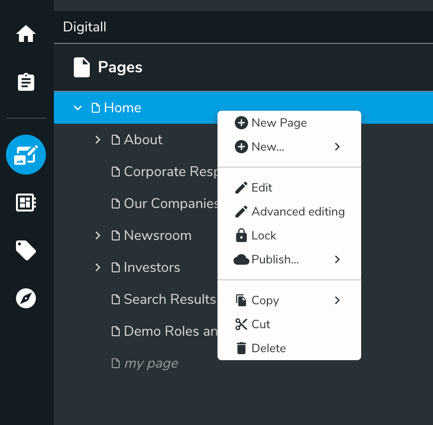
contentItemContextActions
Contextual (right-click) menu for each node displayed in jContent

contentItemActions
3 dots menu for each node displayed in jContent (when applicable)

browseControlBar
3 dots menu for the main node (current page or folder) in jContent header

contentActions target will be added on all contextual menus listed above towards the bottom of the menu list by default for now during deprecation but will be subject to removal in the future.See this page for more information on how to add UI actions in Jahia. You can find an example module that provides a custom content action here.
Overriding New… menu items
Creation menu items in context menu can be overridden to add or replace with custom nodetypes.
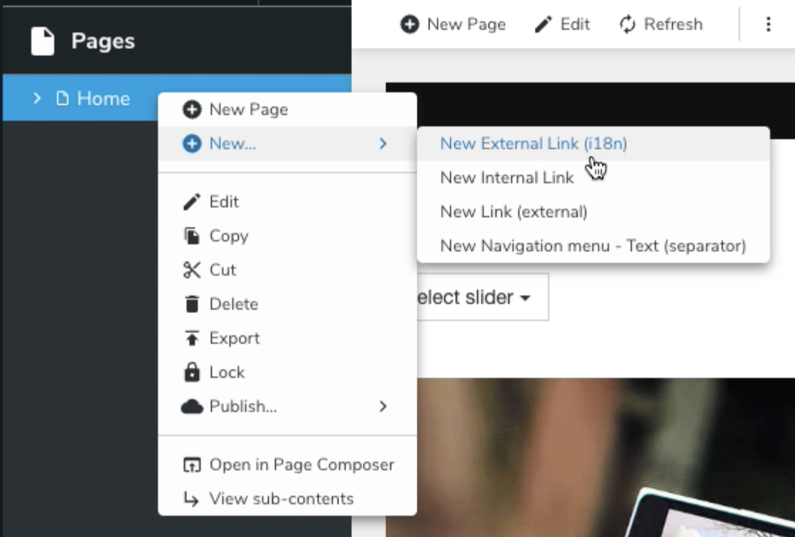
This list is defined in createNavMenuItem action defined here.
Prerequisites
- A module setup for registering actions (see Registering Actions)
- Nodetype definition for the new entry to add (we use
jnt:externalLinkI18nin our example below)
Procedure
Override context menu entries by extending existing action createNavMenuItem with the following code. In this example, we are replacing jnt:externalLink create entry with our own jnt:externalLinkI18n node type:
const navNewItemAction = registry.get('action', 'createNavMenuItem');
// existing nodeTypes without 'jnt:externalLink'
const nodeTypes = navNewItemAction.nodeTypes.filter(nt => nt !== 'jnt:externalLink')
// add new external link i18n nodetype
nodeTypes.push('jnt:externalLinkI18n');
// clear nodeTypes and redefine
navNewItemAction.nodeTypes = undefined;
// extend navNewItemAction with overridden nodeTypes
registry.addOrReplace('action', 'createNavMenuItem', navNewItemAction, {nodeTypes});