Mobile web developer guide
Introduction
This document presents one of the two main possibilities of how to address the mobile rendering needs for your CMS/WCM projects using Jahia's Digital Factory platform.
Our product has two technologies that can help in this regard:
- Channel-based rendering and editing
- REST API to build native clients
This guide covers the first technology. If you're interested in the second, building native mobile applications using Digital Factory, please read our companion document: Native mobile developer guide.
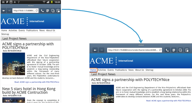
Here below we present an example of the first approach, meaning that we use different channel renderings to build layouts and navigation that are customized for mobile browsing.
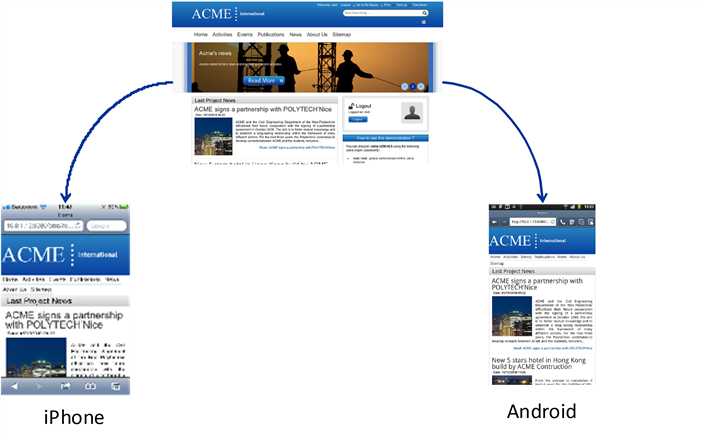
In this example you can see that the same content may be re-used in different layouts, and these may be shared across devices. Specific renderings may be developed for each class of device. It is also important to note that content may be organized differently even when re-using the same content objects.
As you will see, developing mobile applications with Digital Factory is both straightforward and powerful. It is possible to deliver mobile solutions using our default templates without any code modifications, simply by selecting content objects that should appear or not in a page, or dig deeper into the system to customize the look and feel of a mobile sites to your specific requirements.
Target audience & assumptions
In this document it is assumed that the reader has a working knowledge of the following:
- Java programming
- JSP programming
- Digital Factory template development
If you are not familiar with one of the above-mentioned fields, we recommend you get at least familiar with them. For Jahia template development, please check our documentation on http://www.jahia.com.
The first chapters will be more focus on presenting some of the concepts behind mobile application development using the Digital Factory platform, but the next ones will go into technical details as how to implement such solutions. A working knowledge of Digital Factory development and integration is therefore strongly recommended.
Channels
What is a channel?
Before we go any further, it is important to define what we mean by a rendering channel. A channel is identified by a set of properties, or capabilities, that define what the rendering output may be capable of displaying. So this way we could have an iOS channel, an Android channel, or be even more precise and have iPhone 1, iPhone 2, iPhone 3GS channels, and differentiate between the different target devices using precise channel definitions. A channel could also be used to define different page rendering for legacy browsers, such as targeting an old Netscape browser or an old browser included in a set-top box.
A channel is an object that is resolved at rendering time by Digital Factory's core engine, and this is performed by the channel resolver service. The channel resolver is a pluggable system that may accept one of more channel provider implementations, which makes it easy to customize or extend the resolution of channels.
Channel properties may include values such as the screen resolution, different browser plugins that are available (such as Flash, Java, etc…), an icon to display the channel in Digital Factory ‘s user interface or any other informative property. There are also standard sets of capabilities defined by collective Internet efforts such as the Wireless Universal Resource File (WURFL, http://wurfl.sourceforge.net). These sets may be available as free downloads (but beware of the license terms, they might be restrictive) or available as an online resolution web service (for example Detect Right (http://www.detectright.com) or 51Degrees (http://51degrees.mobi)). In the case of an online resolution service, it would be possible to integrate into Digital Factory by implementing a new channel provider for such a service, and therefore benefit from their database of capabilities inside your CMS project.
Built-in channels
Digital Factory's default channel provider implementation is quite basic yet powerful and extensible. It simply uses user agent pattern matching to resolve a channel from the incoming browser using channel definitions declared in an XML file. The default XML channel definition file contains channel definitions such as: iPhone, iPad, Android and Kindle Fire. Here is an example of the XML channel definition for the iPhone:
<bean class="org.jahia.services.channels.Channel" id="apple_iphone_ver1">
    <property name="identifier" value="apple_iphone_ver1"/>
    <property name="fallBack" value="generic_mobile"/>
    <property name="capabilities">
        <map>
            <entry key="display-name" value="iPhone"/>
            <entry key="template-type-mapping" value="iphone"/>
            <entry key="variants" value="portrait,landscape"/>
            <entry key="variants-displayNames" value="Portrait,Landscape"/>
            <entry key="usable-resolutions" value="320x356,480x208"/>
            <entry key="device-image" value="/modules/channels/images/devices/iphone-small.png"/>
            <entry key="decorator-images"
                   value="/modules/channels/images/devices/iphone-portrait.png,/modules/channels/images/devices/iphone-landscape.png"/>
            <entry key="decorator-image-sizes" value="388x738,734x383"/>
            <entry key="decorator-screen-positions" value="35x216,124x115"/>
            <entry key="resolution_width" value="320"/>
            <entry key="resolution_height" value="480"/>
            <entry key="userAgentPattern" value=".*iPhone.*"/>
        </map>
    </property>
</bean>
The most important part of a channel capabilities definition when using the default channel provider is the userAgentPattern, which is used to match against the incoming browser's user agent string. Some of the entries in the capabilities table are used internally by Jahia to display UI elements, such as the decorator-images property that points to images representing the channel's device. It is of course possible to extend the list of available channels when needed, simply by adding them to the channel definition XML file (deployed in modules/channels/META-INF/spring/mod-channels.xml).
Channel selection user interface
Starting with version 6.6.1 Enterprise Edition, Digital Factory's user interface introduced the possibility to preview in Edit and Studio modes the layout for a selected channel. Here is an example for the iPhone channel:
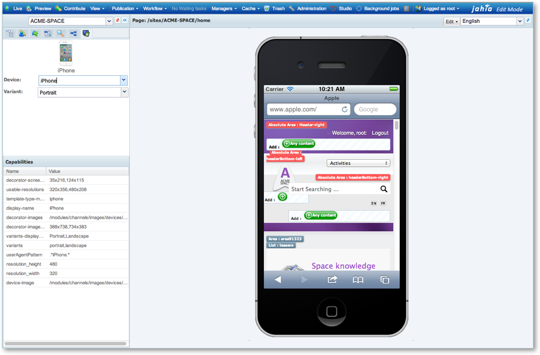
As you can see in the above screenshot, this is actually a live preview, meaning that you can still edit the content inside the device view, and immediately see the result as it would appear on the real hardware. In order to access the channel view, first select the "Mobile" tab:

Then select the device and the variant (usually the orientation) you want to display. Variants make it possible to provide multiple rendering alternatives for the same channel, for example different orientations for a device.
Content inclusion/exclusion from channels
Digital Factory provides a very easy way to include or exclude certain content areas from a channel. A new tab in the edit popup window entitled "Channels" is now available and allows to specify if the content object being edited (in Edit or Studio mode) should be rendered for a specific channel or not.
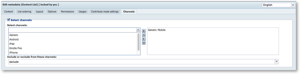
In the above screenshot you can see that the currently edited object has been excluded from the "Generic Mobile" channel which is the parent channel for all mobile channels, meaning that the content will never be displayed for any channel that is a child of the "Generic Mobile" channel (this parent-child relationship is defined in the channel definition XML).
Declaring new channels
As we have quickly presented in the channel introduction, it is of course possible to define new channels, simply by adding additional entries into the modules/channels/META-INF/spring/mod-channels.xml file.
Let's look more closely at the iPhone definition we had shown previously:
<bean class="org.jahia.services.channels.Channel" id="apple_iphone_ver1">
    <property name="identifier" value="apple_iphone_ver1"/>
    <property name="fallBack" value="generic_mobile"/>
    <property name="capabilities">
        <map>
            <entry key="display-name" value="iPhone"/>
            <entry key="template-type-mapping" value="iphone"/>
            <entry key="variants" value="portrait,landscape"/>
            <entry key="variants-displayNames" value="Portrait,Landscape"/>
            <entry key="usable-resolutions" value="320x356,480x208"/>
            <entry key="device-image" value="/modules/channels/images/devices/iphone-small.png"/>
            <entry key="decorator-images"
                   value="/modules/channels/images/devices/iphone-portrait.png,/modules/channels/images/devices/iphone-landscape.png"/>
            <entry key="decorator-image-sizes" value="388x738,734x383"/>
            <entry key="decorator-screen-positions" value="35x216,124x115"/>
            <entry key="resolution_width" value="320"/>
            <entry key="resolution_height" value="480"/>
            <entry key="userAgentPattern" value=".*iPhone.*"/>
        </map>
    </property>
</bean>
Here are the details for the most important channel fields that must be present for mobile edit and preview modes to function:
identifier: a unique identifier for the channel. This will also be used to identify the channel uniquely in Digital Factory's data structure so make sure you do not re-used identifiers when defining channels. It is also used in the fallBack field.fallBack: the name of an identifier that will be the "fallBack" for this definition, meaning that anything that applies to the fallBack will apply to this definition. If for example exclusions or inclusions are specified in the fallBack they will also apply to the current channel definition. All fallBacks must be defined in the XML file except for the root fallBack named "generic"capabilities: a map of key/values that describe capabilities of the channel, with some specific values that will be used by Digital Factory to build it'd user interface, notably:display-name: a name for the channel that will be displayed to end-users in the UItemplate-type-mapping: this is used to specify which template type will be concatenated to the current template type when the channel is resolved, meaning that it will use the value specified here to look for views in the file system by concatenating it to the current template type. So for example for the "html" template type it will look for a "html-iphone" template type on disk before falling back to the "html" template type if no specific channel view has been defined in modules.variants: this capability defines the identifiers and number of variants available for a channel. Usually for mobile devices this is a list of the supported orientations for the device. Variants also influence other capabilities as they will have values for each variant, as you will see in the various resolution and positioning capabilities below.variants-displayNames: the names of the variants defined here will be used in the user interface presented to the end users, so make sure to choose variant names that are meaningful and self-explanatory.usable-resolutions: this is not the full resolution of the device for the current channel, but the actual screen area that is available within the device's web browser. So this is the real screen space a web page will have at disposition to display content since other UI elements may take up screen space such as the location bar, button bars, and so on. This value is multi-valued with a value defined for each declared variant.device-image: a file that contains an icon (64x64 pixels) that is used to display the channel in the list of available channel in the user interface.decorator-images: image files for each variant that contain the "wrapper image" for the device around the usable space. These may be any size, but their size and position must be defined in the decorator-image-sizes and decorator-screen-positions capabilitiesdecorator-image-sizes: for the above image files the size of these images for each variant. This value is mandatory as it is needed for proper positioning of the images on the UI.decorator-screen-positions: these are actually horizontal and vertical offsets into each decorator image variant as to where the actual web screen will be positioned. The size of the web screen is defined in the usable-resolutions capability. This value is also mandatory.userAgentPattern: this is a Java regular expression pattern that will be used to match the incoming browser's request user agent string against all channels to determine which is the currently active channel.
This completes the list of Digital Factory specific capabilities; of course you may add others (as the resolution capabilities in the above example) to fit any specific needs. We will show later how to access the capabilities from content views in order to build custom HTML rendering using capability values.
Implementing a custom channel provider (example: WURFL provider)
By default, Digital Factory comes bundled with it's own default channel provider implementation called UserAgentChannelProvider, that uses the mod-channels.xml XML file to match the incoming browser's user agent string against regular expression patterns. But it is also possible to implement other customer channel providers, as we mentioned in the introduction, to either integrate with external mobile handset databases or with external mobile detection online web services.
We actually have an example of a custom channel provider that provides mobile channel resolution against the WURFL dataset. The WURFL dataset is widely used by companies including Facebook or Google and is possibly one of the first comprehensive efforts to track all major mobile handsets.
To build our custom channel provider, the first thing we need to do is to create a new Spring file in our module and declare the new channel provider class inside of it. This may be done the following way:
<?xml version="1.0" encoding="UTF-8"?>
<beans xmlns="http://www.springframework.org/schema/beans"
       xmlns:xsi="http://www.w3.org/2001/XMLSchema-instance"
       xsi:schemaLocation="http://www.springframework.org/schema/beans http://www.springframework.org/schema/beans/spring-beans-2.0.xsd">
    <bean id="WURFLChannelProvider" class="org.jahia.modules.wurfl.WURFLProvider">
        <property name="priority" value="0"/>
        <property name="channelService" ref="ChannelService"/>
        <property name="wurflModel" ref="wurflModel"/>
        <property name="wurflManager" ref="wurflManager"/>
    </bean>
As you can see above, the channelService bean points to the ChannelService, which regroups all channel providers and uses them for channel resolution. The other two WURFL properties are populated using other beans that we will not detail below but that you may find in our example available online in the following GitHub repository: https://github.com/Jahia/WURFLProvider. All the code in the repository is only an example and should not be considered production ready, but it gives you a good idea of how to implement your own custom channel provider.
The Channel provider class must simply implement an interface named "ChannelProvider" that looks like this:
/**
 * A channel provider will implement the functionality to resolve and provide list of channels
 */
public interface ChannelProvider {
    public int getPriority();
    public Map<String,String> getChannelCapabilities(String identifier);
    public String resolveChannel(HttpServletRequest request);
    public List<String> getAllChannels();
    public String getFallBack(String identifier);
    public boolean isVisible(String identifier);
}
You can see in the full GitHub project the implementation for the WURFL provider that it is quite straightforward and simply implements the above methods (please note that the getAllChannels method in the WURFL example is not implemented, it simply returns an empty list).
One important point to remember is that the channel service will merge results from different channel providers, making it possible to use multiple channels provider to provide capabilities for a specific channel. The merging is done based on the channel identifier and so you must make sure that you use the same identifiers across multiple channel providers for the capabilities merging to work. This makes it possible to easily augment data coming from Digital Factory's default channel provider with data coming from external channel providers. In the case of Digital Factory's default provider, we have chosen to match our identifiers with the WURFL identifier but you might want to change that if integrating with another handset database or online web service.
Previewing pages for a given channel
At any time, editors can request a preview of the current page for a given channel.
This option is accessible in the View menu (toolbar) > Customized Preview. Here, the editor can choose the desired channel
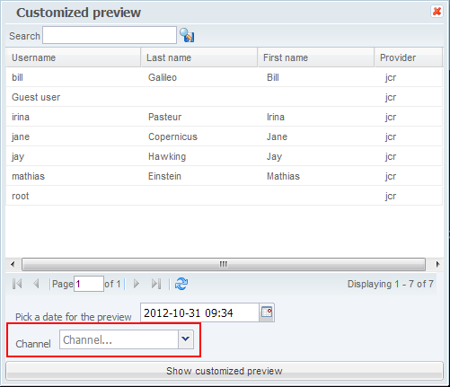
then the orientation

The result appears in a new window
How channel rendering works
In order to fully understand the rendering of a mobile page, let's illustrate it with an example of template and view resolution in the case of an iPad accessing the default site's home page.

Rendering steps:
- Digital Factory receives an URL (http://localhost:8080) from a mobile device, an iPad in this case, for the default's site home page
- Digital Factory's rendering servlet resolves the channel according to the user agent, and concatenates the value of the "
template-type-mapping" specified in the channel to the current template type. In our example thetemplate-type-mappingis "ipad" while the current template type is "html" and therefore the fulltemplate-typewill be "html-ipad". - Digital Factory loads the template from the template set for the default site's home page
- Digital Factory first looks for a view (for the jnt:template type) in Digital Factory's filesystem deployed modules, first by trying to find a file named
jnt_template/html-ipad/template.VIEW.jsp(whereVIEWis the specified studio-specified view for the currently used jnt:template object). If there is no "html-ipad" template type available on disk, it will fallback to "html" for the template-type and try to load a view file using thejnt_template/html/template.VIEW.jspfilesystem location. This lookup process is automatic and requires no user intervention. - Digital Factory renders the page by iterating over the content objects in the page, using the template to figure out which views must be used, each time first looking for "html-ipad" template types to be able to customize the views for a mobile device and falling back to the default template type ("html") if they don't exist.
As you can see this simple yet powerful mechanism makes it possible to do all kinds rendering based on user agent matching. You could even use it to render for specific desktop user agents (such as legacy ones). The fallback mechanism is also important because you do not have to redefine all content views if you just intend to modify a few of them. This enables "forking" of the some subset of views to implement the required rendering for the target channel.
Example
We will now look at an example of a mobile view located on the filesystem at the location modules/template-web-space/jnt_template/html-mobile/template.templates-web-space.jsp that provides an alternate template type to the default view defined in modules/template-web-webpace/jnt_template/html/template.templates-web-space.jsp and that is packaged with Digital Factory's default template set module package.
Let's first look at the default "standard" html/template.templates-web-space.jsp :
<!DOCTYPE html PUBLIC "-//W3C//DTD XHTML 1.0 Transitional//EN"
"http://www.w3.org/TR/xhtml1/DTD/xhtml1-transitional.dtd">
<%@ page language="java" contentType="text/html;charset=UTF-8" %>
<%@ taglib prefix="template" uri="http://www.jahia.org/tags/templateLib" %>
<%@ taglib prefix="c" uri="http://java.sun.com/jsp/jstl/core" %>
<%@ taglib prefix="fn" uri="http://java.sun.com/jsp/jstl/functions" %>
<%@ taglib prefix="jcr" uri="http://www.jahia.org/tags/jcr" %>
<%--@elvariable id="currentNode" type="org.jahia.services.content.JCRNodeWrapper"--%>
<%--@elvariable id="out" type="java.io.PrintWriter"--%>
<%--@elvariable id="script" type="org.jahia.services.render.scripting.Script"--%>
<%--@elvariable id="scriptInfo" type="java.lang.String"--%>
<%--@elvariable id="workspace" type="java.lang.String"--%>
<%--@elvariable id="renderContext" type="org.jahia.services.render.RenderContext"--%>
<%--@elvariable id="currentResource" type="org.jahia.services.render.Resource"--%>
<%--@elvariable id="url" type="org.jahia.services.render.URLGenerator"--%>
<html xmlns="http://www.w3.org/1999/xhtml" xml:lang="${fn:substring(renderContext.request.locale,0,2)}">
<head>
    <meta http-equiv="Content-Type" content="text/html; charset=utf-8" />
    <jcr:nodeProperty node="${renderContext.mainResource.node}" name="jcr:description" inherited="true" var="description"/>
    <jcr:nodeProperty node="${renderContext.mainResource.node}" name="jcr:createdBy" inherited="true" var="author"/>
    <jcr:nodeProperty node="${renderContext.mainResource.node}" name="j:keywords" inherited="true" var="kws"/>
    <c:set var="keywords" value=""/>
    <c:forEach items="${kws}" var="keyword">
        <c:choose>
            <c:when test="${empty keywords}">
                <c:set var="keywords" value="${keyword.string}"/>
            </c:when>
            <c:otherwise>
                <c:set var="keywords" value="${keywords}, ${keyword.string}"/>
            </c:otherwise>
        </c:choose>
    </c:forEach>
    <c:if test="${!empty description}"><meta name="description" content="${description.string}" /></c:if>
    <c:if test="${!empty author}"><meta name="author" content="${author.string}" /></c:if>
    <c:if test="${!empty keywords}"><meta name="keywords" content="${keywords}" /></c:if>
    <link rel="stylesheet" type="text/css" href="<c:url value='${url.currentModule}/css/print.css'/>" media="print" />
    <title>${fn:escapeXml(renderContext.mainResource.node.displayableName)}</title>
</head>
<body>
<div class="bodywrapper"><!--start bodywrapper-->
    <template:area path="pagecontent"/>
</div>
<!--stop bodywrapper-->
<c:if test="${renderContext.editMode}">
    <template:addResources type="css" resources="edit.css" />
</c:if>
<template:addResources type="css" resources="960.css,01web.css,02mod.css,navigation.css,navigationN2-2.css"/>
<template:theme/>
</body>
</html>
In the default template, the important tag to note is the <template:area> one that is included in the bodywrapper DIV tag. This is where all the main page elements will be inserted.
Now let's look at the html-iphone/template.template-web-space.jsp view:
<!DOCTYPE html PUBLIC "-//W3C//DTD XHTML 1.0 Transitional//EN"
"http://www.w3.org/TR/xhtml1/DTD/xhtml1-transitional.dtd">
<%@ page language="java" contentType="text/html;charset=UTF-8" %>
<%@ taglib prefix="template" uri="http://www.jahia.org/tags/templateLib" %>
<%@ taglib prefix="c" uri="http://java.sun.com/jsp/jstl/core" %>
<%@ taglib prefix="fn" uri="http://java.sun.com/jsp/jstl/functions" %>
<%@ taglib prefix="jcr" uri="http://www.jahia.org/tags/jcr" %>
<%--@elvariable id="currentNode" type="org.jahia.services.content.JCRNodeWrapper"--%>
<%--@elvariable id="out" type="java.io.PrintWriter"--%>
<%--@elvariable id="script" type="org.jahia.services.render.scripting.Script"--%>
<%--@elvariable id="scriptInfo" type="java.lang.String"--%>
<%--@elvariable id="workspace" type="java.lang.String"--%>
<%--@elvariable id="renderContext" type="org.jahia.services.render.RenderContext"--%>
<%--@elvariable id="currentResource" type="org.jahia.services.render.Resource"--%>
<%--@elvariable id="url" type="org.jahia.services.render.URLGenerator"--%>
<html xmlns="http://www.w3.org/1999/xhtml" xml:lang="${fn:substring(renderContext.request.locale,0,2)}">
<head>
    <meta http-equiv="Content-Type" content="text/html; charset=utf-8" />
    <meta name='HandheldFriendly' content='True'/>
    <meta name="viewport" content="initial-scale=1.0, minimum-scale=1.0, maximum-scale=1.0, width=device-width, user-scalable=no">
    <meta name="apple-mobile-web-app-capable" content="yes" />
    <meta names="apple-mobile-web-app-status-bar-style" content="black-translucent" />
    <jcr:nodeProperty node="${renderContext.mainResource.node}" name="jcr:description" inherited="true" var="description"/>
    <jcr:nodeProperty node="${renderContext.mainResource.node}" name="jcr:createdBy" inherited="true" var="author"/>
    <jcr:nodeProperty node="${renderContext.mainResource.node}" name="j:keywords" inherited="true" var="kws"/>
    <c:set var="keywords" value=""/>
    <c:forEach items="${kws}" var="keyword">
        <c:choose>
            <c:when test="${empty keywords}">
                <c:set var="keywords" value="${keyword.string}"/>
            </c:when>
            <c:otherwise>
                <c:set var="keywords" value="${keywords}, ${keyword.string}"/>
            </c:otherwise>
        </c:choose>
    </c:forEach>
    <c:if test="${!empty description}"><meta name="description" content="${description.string}" /></c:if>
    <c:if test="${!empty author}"><meta name="author" content="${author.string}" /></c:if>
    <c:if test="${!empty keywords}"><meta name="keywords" content="${keywords}" /></c:if>
    <link rel="stylesheet" type="text/css" href="<c:url value='${url.currentModule}/css/print.css'/>" media="print" />
    <title>${fn:escapeXml(renderContext.mainResource.node.displayableName)}</title>
</head>
<body>
<div class="bodywrapper"><!--start bodywrapper-->
    <template:area path="pagecontent"/>
</div>
<c:if test="${renderContext.editMode}">
    <template:addResources type="css" resources="edit.css" />
</c:if>
<template:addResources type="css" resources="960.css,01web.css,02mod.css,navigation.css,navigationN2-2.css,responsive.css"/>
<template:theme/>
</body>
</html>
If we look at the differences between the files, the first one is in the header section, specifically in the "meta" tags:
<meta name="viewport" content="width=device-width; initial-scale=1.0; maximum-scale=1.0; user-scalable=0;" />
<meta name="apple-mobile-web-app-capable" content="yes" />
<meta name="apple-mobile-web-app-status-bar-style" content="black-translucent" />
These meta-tags are iPhone/Android specific, and control how the mobile browser window will be setup.
The next difference, and the most important one, is in the template resources section:
<template:addResources type="css" resources="960.css,01web.css,02mod.css,navigation.css,navigationN2-2.css,responsive.css"/>
The most important modification in the CSS file list is the use of the responsive design layout style that makes it easy to build layouts that scale from a mobile device to a desktop one. This is made possible using CSS media queries which are now supported on most mobile and desktop platforms. Using queries it is possible to change any CSS property including font sizes, hiding elements, resizing boxes and so on.
Here is an example of a CSS media query that will only apply styles to the body and a specific div tag if the viewing area is less than 765 pixels wide:
<style type="text/css">
    @media screen and (max-width: 765px){
        body{
            font-size: 80%;
        }
        div#leftcolumn{
            display: none;
        }
    }
</style>
Device orientation
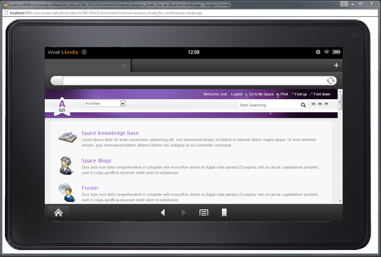
A problem specific to modern mobile devices, especially smartphones, is dealing with device orientation. Because of this it is important to use fluid layouts that will automatically adapt to the changes in screen size when the device is rotated. Again, this happens by default with the templates provided in this example, as you may see in the screenshot below:
It is also important to always validate layouts on the device itself, instead of using emulators, as sometimes they may differ.
Accessing channel capabilities
Once resolved, the currently active channel is available in Digital Factory's RenderContext so, using Java, it may simply be accessed using the following accessor:
RenderContext.getChannel()
Or in JSPs it accessible through the global renderContext variable using the following EL expression:
${renderContext.channel}
The Channel class has the following interface (simplified for readability):
/**
 * A channel describes a rendering target, so it may be a mobile device or any other kind of rendering browser
 * /technologies (RSS), etc...
 */
public class Channel implements Serializable {
    public static final String GENERIC_CHANNEL = "generic";
    ...
    public String getIdentifier() {
        return identifier;
    }
    public Map<String, String> getCapabilities() {
        return capabilities;
    }
    public boolean hasCapabilityValue(String capabilityName) {
        return capabilities.containsKey(capabilityName);
    }
    public String getCapability(String capabilityName) {
        return capabilities.get(capabilityName);
    }
    public String getFallBack() {
        return fallBack;
    }
    public boolean isVisible() {
        return visible;
    }
    public boolean isGeneric() {
        return identifier.equals(GENERIC_CHANNEL);
    }
}
So it is quite easy to access the channel's identifier, as in this example:
${renderContext.channel.identifier}
Accessing a channel capability is also very simple, as in the following example that returns the list of usable-resolutions for each variant of the currently active channel:
${renderContext.channel.capabilities['usable-resolutions']}
Capabilities particularly interesting if testing for supported technologies, such as testing if a Flash or Java plugin is available on the device currently browsing the site. As the names of these capabilities will differ from one channel provider implementation to another you will have to choose channel providers wisely.
For example, this is how you would test for Flash playback support using a WURFL channel provider implementation:
<c:if test="renderContext.capabilities['playback_flv'] == 'true'">
    <!—Build Flash playback UI -->
</c:if>
As you can see it is quite easy to access channel capabilities and as you may define your own either in Digital Factory's default channel provider XML files or in your own custom channel provider implementation, the sky is the limit as to what you may integrate using channel capabilities.
Integration with Digital Factory's front-end cache
As you might already know, Digital Factory comes built-in with a high-performance front-end HTML cache. This cache is used to avoid rebuilding content on each HTTP request, and integrates with many of the server's technologies such as permissions, content editing and so on. On the channel side, Digital Factory will automatically create different cache entries for each template-type. Each time a different template type (such as "html-ipad" or "html-mobile") is used, a different HTML cache entry will be created for the associated content object.
However, if inside a view you include conditional code that reads capabilities to change the rendering, this will not work as expected with the front-end cache activated. Instead the current rendering will be cached and subsequent requests, even with different values for the same capability, will receive the cached content instead of generating a new custom rendering. You will then have to deactivate the cache for that particular content object (see the cache documentation on how to achieve this) and this may affect performance. Therefore for high performance web sites it is best to design the rendering to define channels more finely than trying to use a lot of conditional code that uses capabilities.
Mobile rendering frameworks
We present in this section a few frameworks or technologies that will make building mobile applications easier and that can adapt to very different mobile devices, ranging from phones to tablets to desktop web sites.
Fluid/responsive layouts
As illustrated in the default template-web-space example provided with Digital Factory's default packaged demo site, it is highly recommended to build fluid (aka responsive) layouts that use modern technologies such as CSS media queries to adapt the layout and elements for different screen sizes. As these techniques are maturing, so is the availability of ready-made HTML framekworks. A good example of this is Twitter's Bootstrap HTML layout that uses responsive design to adapt automatically to tablet or smartphone screen restrictions.
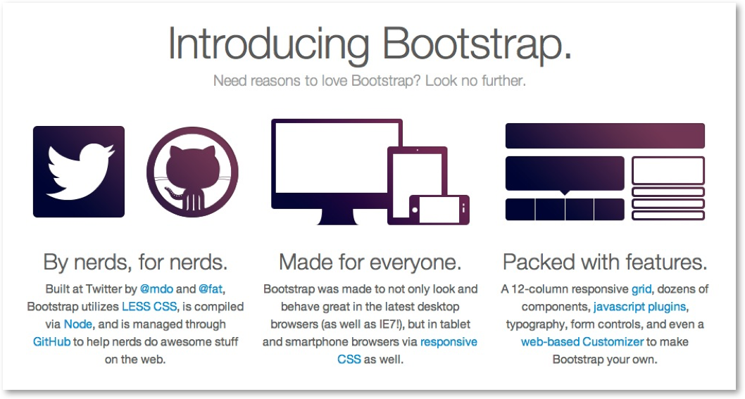
Figure 1 Twitter's Bootstrap HTML Framework
This framework is of course not the only one out there, but it is one of the most used and perfectly suitable for high-quality production sites.
jQuery Mobile
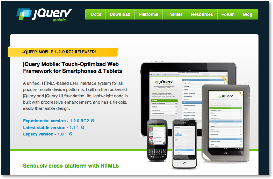
When building a mobile web application you will quickly run into the need to build user interface (UI) elements that are properly sized and usable using touch actions (instead of mouse clicks). Building such elements and making sure that they work properly on a wide range of mobile devices is by itself a daunting task. jQuery Mobile is a high quality free framework that will do all the heavy lifting for you, while at the same time looking great on mobile devices. It is also compatible with a wide range of devices, be they based on iOS, Android, BlackBerry, Windows Phone or others platforms.
Building a UI with jQuery Mobile is also very straightforward. It will build fancy and dynamic mobile UI elements for simple basic HTML elements. Here is an example for a HTML list:
<ul data-role="listview" data-inset="true" data-filter="true">
    <li><a href="#">Acura</a></li>
    <li><a href="#">Audi</a></li>
    <li><a href="#">BMW</a></li>
    <li><a href="#">Cadillac</a></li>
    <li><a href="#">Ferrari</a></li>
</ul>
When displayed using jQuery Mobile it will be rendered like this:
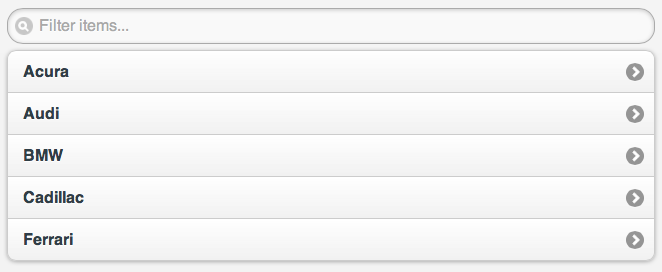
The filter input will actually remove elements using Javascript and dynamically filter the list without involving any HTTP reloading. This example is a good illustration of the power of this platform, and we recommend that you have a look at the framework's documentation if you're interested in learning more.
It is of course fully possible to integrate jQuery Mobile with Digital Factory, for example by providing new views that build jQuery Mobile HTML for existing components. Although this is not provided out of the box, it is not difficult to integrate.
Apache Mobile Filter
For developers that need to build mobile web sites using a combination of technologies sitting behind an Apache Web server, the Apache Mobile Filter project is an interesting solution to provide a single point of handling for mobile detection and rendering. This way an Apache web server may be connected to both a Digital Factory Tomcat installation as well as a PHP server to serve pages that may all benefit from mobile detection technologies. This is a little different from what we have presented using Digital Factory's built-in mobile rendering framework, but it is still worth mentioning as it may prove an interesting solution for some customers. The Apache Mobile Filter comes with interesting modules such as an image-resizing one that makes it easy to dynamically resizes images to fit better on mobile screens (they will also reduce the load on the mobile network as they are smaller to download). We won't go into any details of this framework here, but you can of course find all the appropriate documentation on the framework's website.
Re-targeting content
Introduction
When building mobile web sites or applications, you will need to think about content re-targeting, meaning that you will need to look at adapting content to display properly on smaller screens while at the same reducing its size in order to reduce bandwidth requirements. In this section we will quickly go through a list of the most important re-targeting requirements that needs to be at least considered when building a mobile solution.
Images
Images are the first content object that will need to be re-targeted for mobile devices. Nowadays it is not uncommon to have to deal with high-resolution images, as they are easy to generate with modern photo cameras. There are different ways to deal with large images, either resizing them on the server and serving different versions of the images based on the detected device, or using CSS media queries to resize an image to fit into a size that will look good on a mobile screen. There are advantages and disadvantages to both approaches, so they must be carefully considered when building a mobile solution. The disadvantage of the server-side solution is that it requires server CPU time as well as managing of all the different versions of an image. This may prove a bit troublesome unless it is automated using a framework such as the Apache Mobile Filter we presented earlier in this document. The disadvantage of the client side solution using CSS is that it will require the transfer of the full resolution image over the mobile network which is problematic but at the same time will avoid additional requests if the image will be viewed in full resolution at some point in time (for example for viewing photos on a high resolution iPad). Anyway, in most cases it is best to avoid sending high-resolution images through a mobile network.
Video
Mobile video is even more problematic than images, mostly because of the bandwidth requirements associated with serving the data file, and also because a lot of network providers have bandwidth caps or make people pay for the amount of data they have downloaded. So when delivering video to mobile users, it is important to notify them that data costs may be implied so that they don't get a bad surprise at the end of the month. A lot of desktop online video is actually distributed using the Flash plugin, but on the mobile web it is not recommended to do the same thing, even if target devices do support Flash. The best way to target mobile users is to use HTML 5's new video tag and encode the video using the H264 codec, which is now most widely available. Again here you might want to use device detection technology and capabilities to determine which is the best way to serve videos to the device currently navigating your web site.
Another strong requirement if HTML 5 is chosen is that the web server must have support for HTTP ranges, which is part of the basic HTTP 1.1 standard, but not necessarily implemented in every web server software. Digital Factory does provide support for HTTP ranges so there is nothing more to do than using a video tag to serve H264-encoded videos to iPhones, iPads, Android devices, … If HTTP ranges are not supported, you will get as a result on the mobile device a video that never starts playing, so this makes it easy to detect this case.
Flash
When the iPhone came out, there was a lot of noise generated around its lack of Flash plugin support. Competitors saw an opportunity to release devices that did include Flash support, but unfortunately the technology was never ready for prime time, and browsing a page with Flash elements on a mobile device is usually really slow and may sometimes even crash the mobile browser altogether. This was such a problem that Flash support was even removed from more recent versions of the Android mobile operating system (starting with version 4.0). Therefore it is best to avoid using Flash altogether when targeting mobile devices, and replacing these animations with other technologies such as HTML 5. HTML 5 is really becoming more and more powerful, and is almost capable of doing everything that Flash has been doing, in a more power-efficient and stable way, all without sacrificing image quality or performance. The main problem with replacing Flash with HTML 5 is that the tooling is not as good as it is for Flash, but companies such as Adobe (maker of Flash!) are aware of this situation and are working (hard) on providing new HTML 5 tools to build animations, games, ads and anything you use to build with Flash. So in effect it makes sense to remove existing Flash content from existing sites and replace it with HTML 5, or if you are building a new site, to directly use HTML 5.
Additional resources
We present in this section some references we have presented in this document as well as additional reading material that may be interesting to learn more about mobile technologies.
- Digital Factory's Native mobile developer guide, http://www.jahia.com
- Wireless Universal Resource File, WURFL, http://wurfl.sourceforge.net/
- Apache Mobile Filter, http://www.apachemobilefilter.org
- Apache Mobile Filter documentation , http://wiki.apachemobilefilter.org/
- Apple iOS developer center, http://developer.apple.com/ios
- Google Android developer center, http://developer.android.com/index.html
- Blackberry developer center, https://developer.blackberry.com
- CSS media queries, http://www.w3.org/TR/css3-mediaqueries/
- Adobe Phone Gap, http://phonegap.com
- Apache Cordova, http://incubator.apache.org/cordova/
- Pugpig, http://pugpig.com
- Titanium, http://www.appcelerator.com
- jQuery Mobile, http://jquerymobile.com
- Bootstrap, http://twitter.github.com/bootstrap/